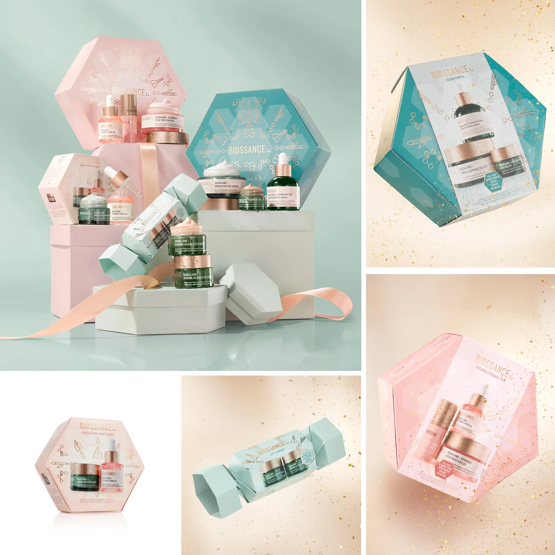
Biossance makes a lot of limited edition products and I loved designing every one of them. Specialized foil stamping, offset printing, spot UV coating, embossing and debossing increased the luxe-factor of the packaging. I partnered with a fantastic team of designers, printers, illustrators, photographers and influencers to tell stories through design.
SOFTWARE: Adobe Illustrator, Adobe Photoshop
CATEGORY: Print, Consumer Packaging
3 sets on-shelf in Sephora stores
2 Black Friday online-only sets
Collaboration set for Reese Witherspoon’s book club
Limited edition Jumbo Omega
Advent Calendar with 12 travel-size products
Cyber Monday gift with purchase serum set
End of Year set with special bag
Senior Designer in collaboration with Creative Director Michelle Riches
Icon illustrations by Lab Partners | Brazillian Flora Illustration by Michelle Riches | Photography by Kevin Twomey
3 sets on-shelf in Sephora stores
Limited edition Jumbo Omega
Online-only eye cream set
Giving Tuesday limited edition gift size Copper Peptide Rapid Plumping Serum (5% of proceeds went to Oceana)
Megabag gift with purchase with Brazilian Flora illustration on a waterproof bikini bag
Art Director and Designer in collaboration with Creative Director Michelle Riches
Icon illustrations by Lab Partners | Brazillian Flora Illustration by Michelle Riches | Photography by Kevin Twomey
Call it a kaleidoscope or a snowflake, the hexagon shape introduced the consumer to Biossance’s scientific structures.
3 sets on-shelf in Sephora stores
Online-only eye cream set
Art Director and Designer in collaboration with Creative Director Michelle Riches
Icon illustrations by Lab Partners | Photography by Kevin Twomey
Biossance x Reese Witherspoon set with limited edition artwork on the products and a travel case.
Art Director and Designer in collaboration with Creative Director Michelle Riches
Photography by Kevin Twomey
Senior Designer in collaboration with Creative Director Michelle Riches
2023 is the Year of the Rabbit and this limited edition Vitamin C Rose Oil was sold primarily in our Asian markets.
Art Director in collaboration with Creative Director Michelle Riches
Year of the Rabbit illustration by Studio MPLS
4th Annual Ocean-themed Biossance + Oceana collaboration set “Hydration on Deck” and Jumbo 100% Squalane with limited edition label and carton artwork. The artwork gives the consumer the feeling of swimming under the waves and 5% of proceeds goes to Oceana.
Art Director and Designer in collaboration with Creative Director Michelle Riches
Photography by Kevin Twomey
As Art Director of Global Packaging and Print for Biossance, I updated and re-imagined the look and feel of products, sets and printed marketing campaigns. I partnered with the digital and marketing teams to ensure brand consistency for all new products and campaigns. I designed the sets to shine individually and live together as a recognizable family on shelf in Sephora stores. They are highlighted with heroic product photography and moisture droplets to show hydration. Sets with travel bags and heroic product imagery were primarily sold online, but available in stores in certain markets.
Art Director and Designer in collaboration with Creative Director Michelle Riches
Photography by Kevin Twomy
SOFTWARE: Adobe Illustrator, Adobe Photoshop
CATEGORY: Print, Consumer Packaging
Squalane + Ectoin Overnight Rescue
Squalane + Enzyme Sugar Body Scrub
Squalane + Copper Peptide Rapid Plumping Serum
Squalane + Retinol Night Serum
Squalane + Vitamin C Rose Moisturizer
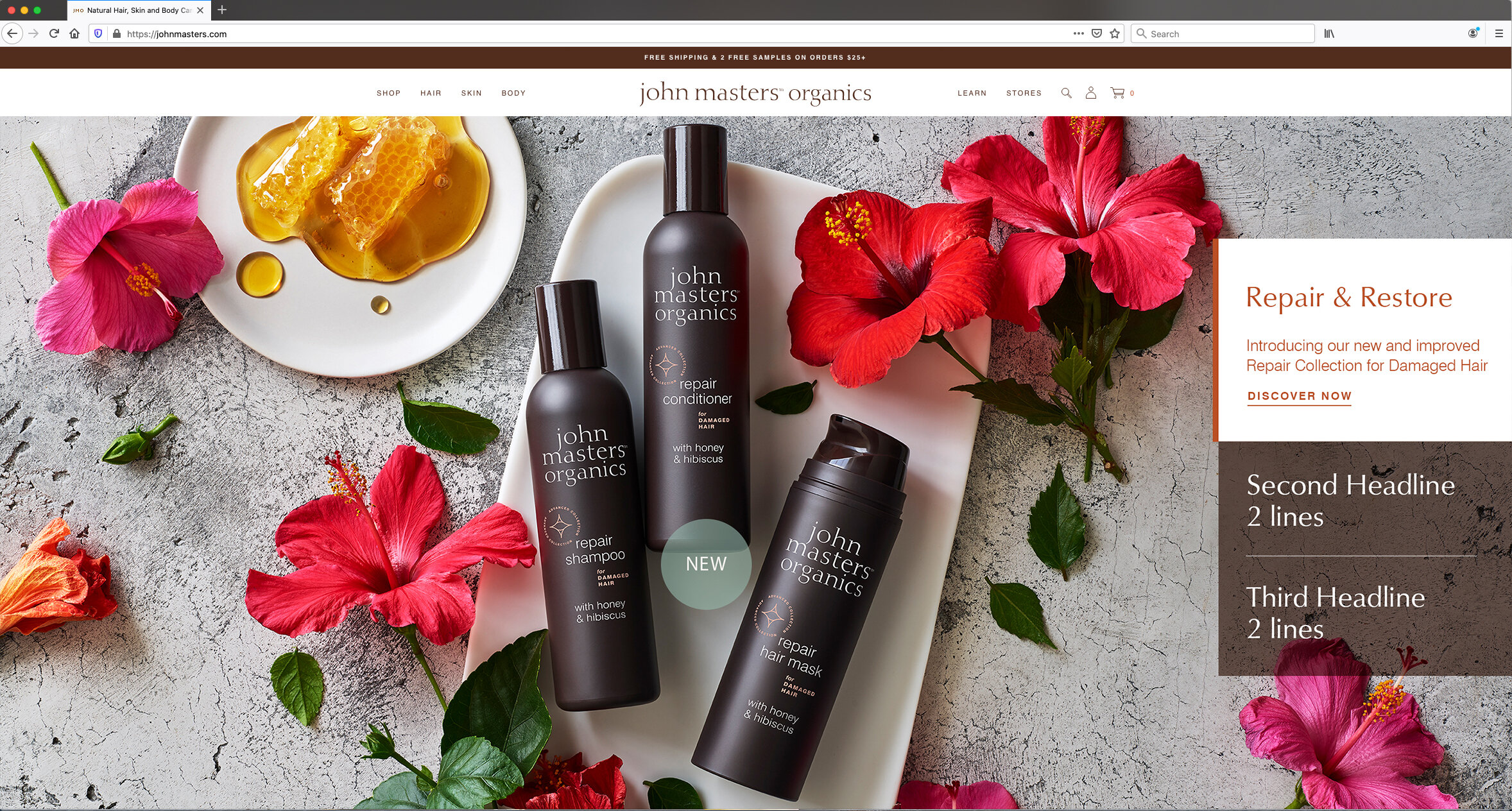
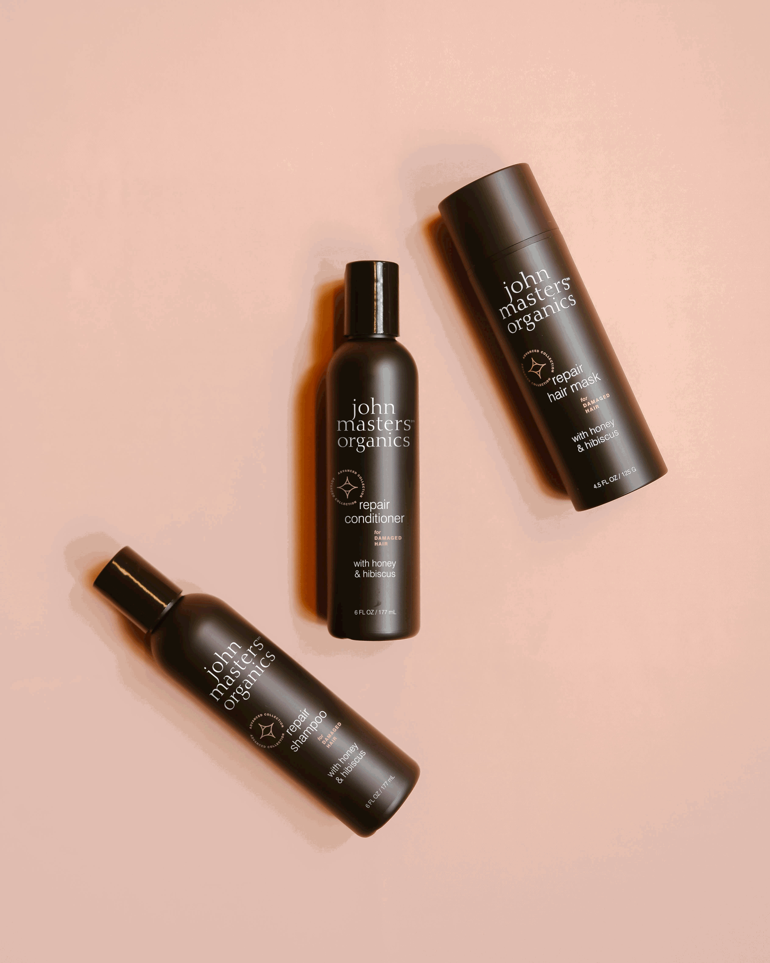
One of my first projects as the package designer at John Masters Organics was to collaborate with the Creative Director to elevate the design of the beloved Lip Calm tubes and boxes to be more in line with the newly designed brand guidelines. Check out the process here. I then designed and illustrated the limited edition versions with a more whimsical style. Taking size and proportions into consideration, I redesigned the haircare line to have a more prestige presence on shelf and a consistent look and feel that was carried out on all of the bottles and jars. And most recently, I streamlined the entire skincare line’s bottles, jars and cartons.
SOFTWARE:
Adobe Illustrator
CATEGORY:
Print, Consumer Packaging
Skincare line, Advanced Haircare line, Body care, Dry Shampoo and Jumbo Hair Milk
Senior Designer in collaboration with Creative Director Alex Regilio
Holiday gifting sets and limited edition body products
Art Director in collaboration with Creative Director Alex Regilio
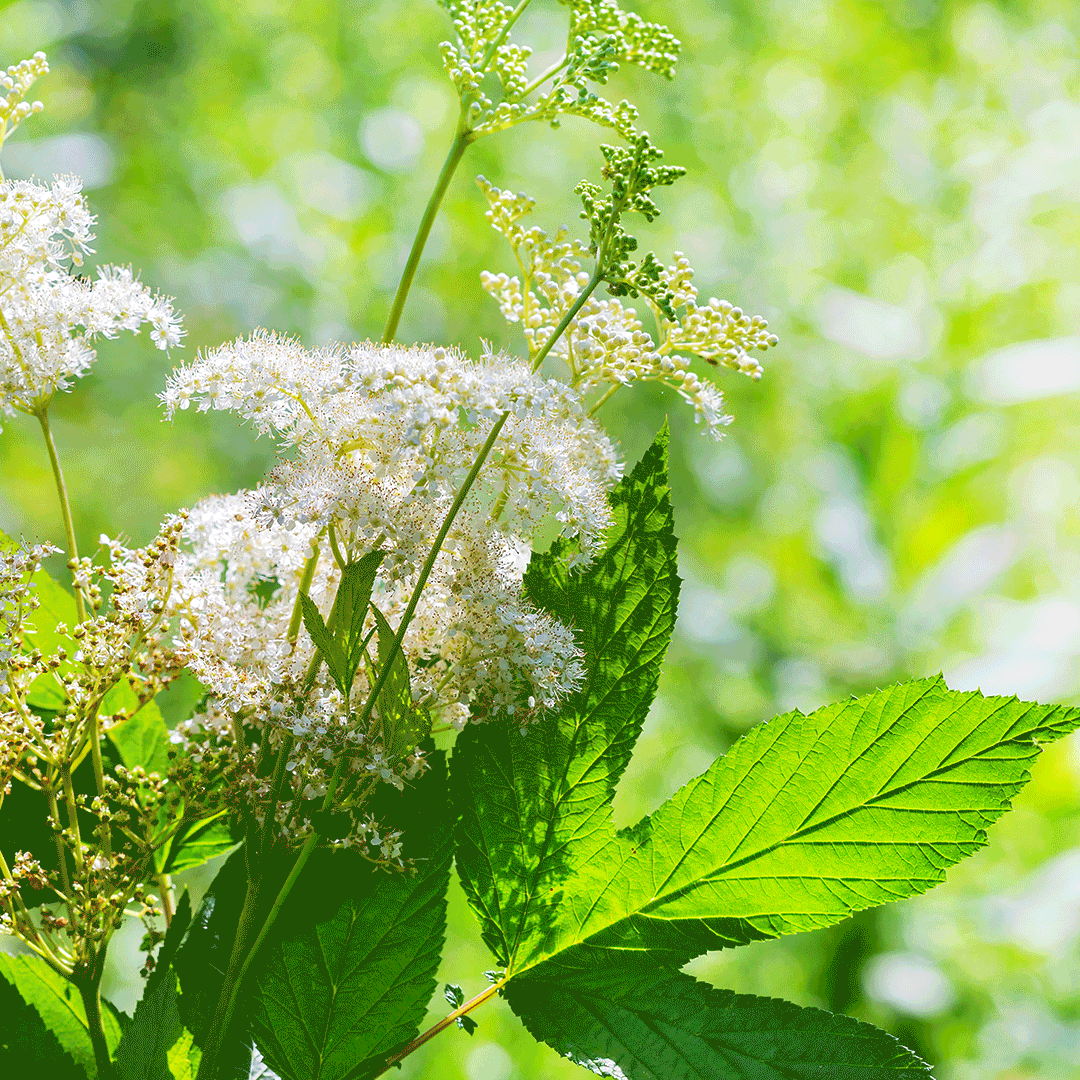
Fig & vetiver and holiday ornament flora illustrations by Simona Bunardzhieva
Art Director and Designer in collaboration with Creative Director Alex Regilio
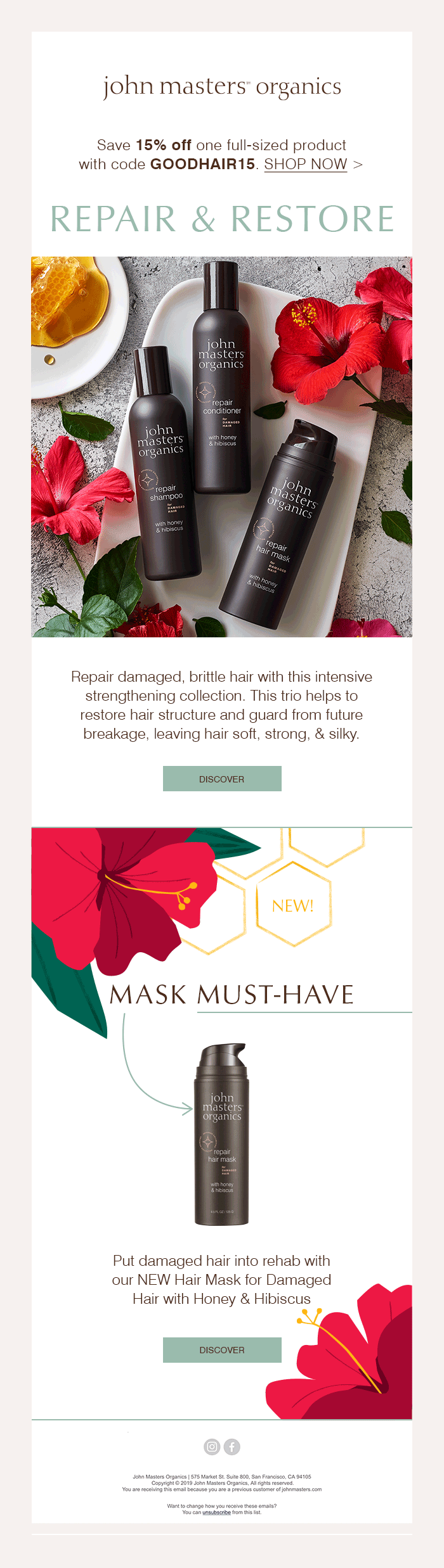
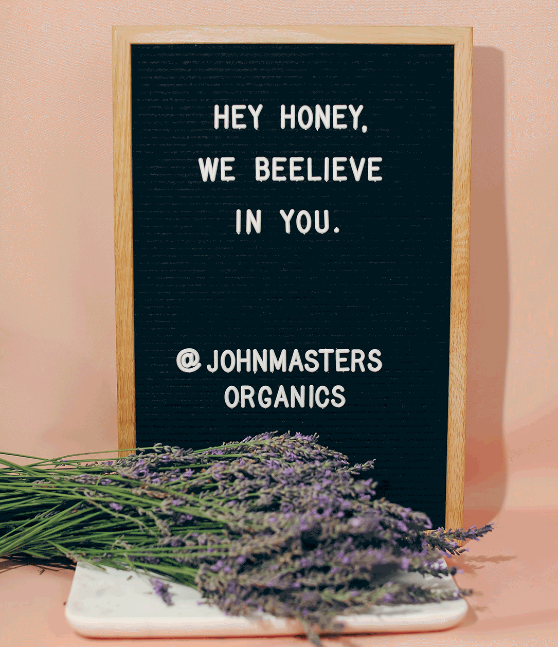
In additions to the package design for John Masters Organics, I also supported the E-commerce team by working with them to conceptualize and design email campaigns that included homepage artwork and often social media artwork. Sometimes the emails would have animations that would also translate to the social media posts. Some would also have ads. These are some of the more successful campaigns.
SOFTWARE:
Adobe Illustrator, Adobe Photoshop
CATEGORY:
Digital Marketing
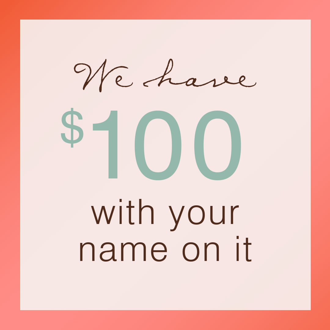
The Black Friday Sale VIP Early Access Email brought in $72,979 in two days for John Masters Organics. The regular Black Friday Sale email brought in an additional $22,670. Go VIPs!!
Art Director and Designer
160px x 600px, 336px x 280px, 120px x 600px, 250px x 250px, 320px x 50px, 728px x 90px
The Earth Day Sale VIP Early Access Email was second to the Black Friday Sale, bringing in $40,890. The regular Earth Day Sale Email brought in an additional $27,800.
The Friends & Family Sale ranked third overall in the success of the campaign, with the VIP Early Access bringing in $22,200 and the regular email capturing $27,300.
160px x 600px, 336px x 280px, 120px x 600px, 250px x 250px, 320px x 50px, 728px x 90px
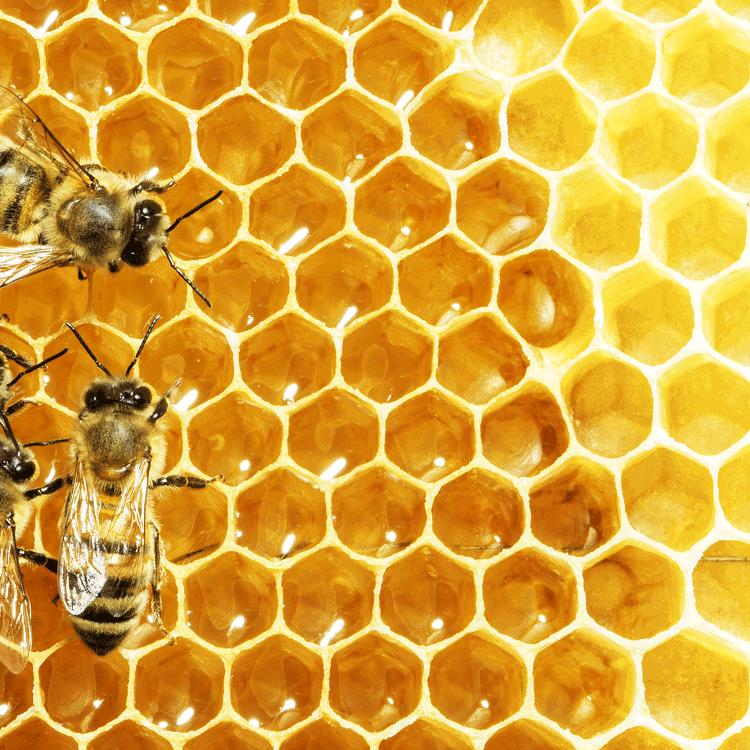
The Honey & Hibiscus launch campaign brought $4,700. Not bad for a non-sale campaign!
160px x 600px, 336px x 280px, 120px x 600px, 250px x 250px, 320px x 50px, 728px x 90px
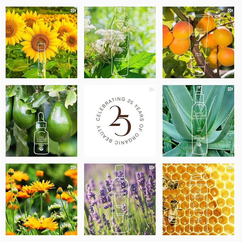
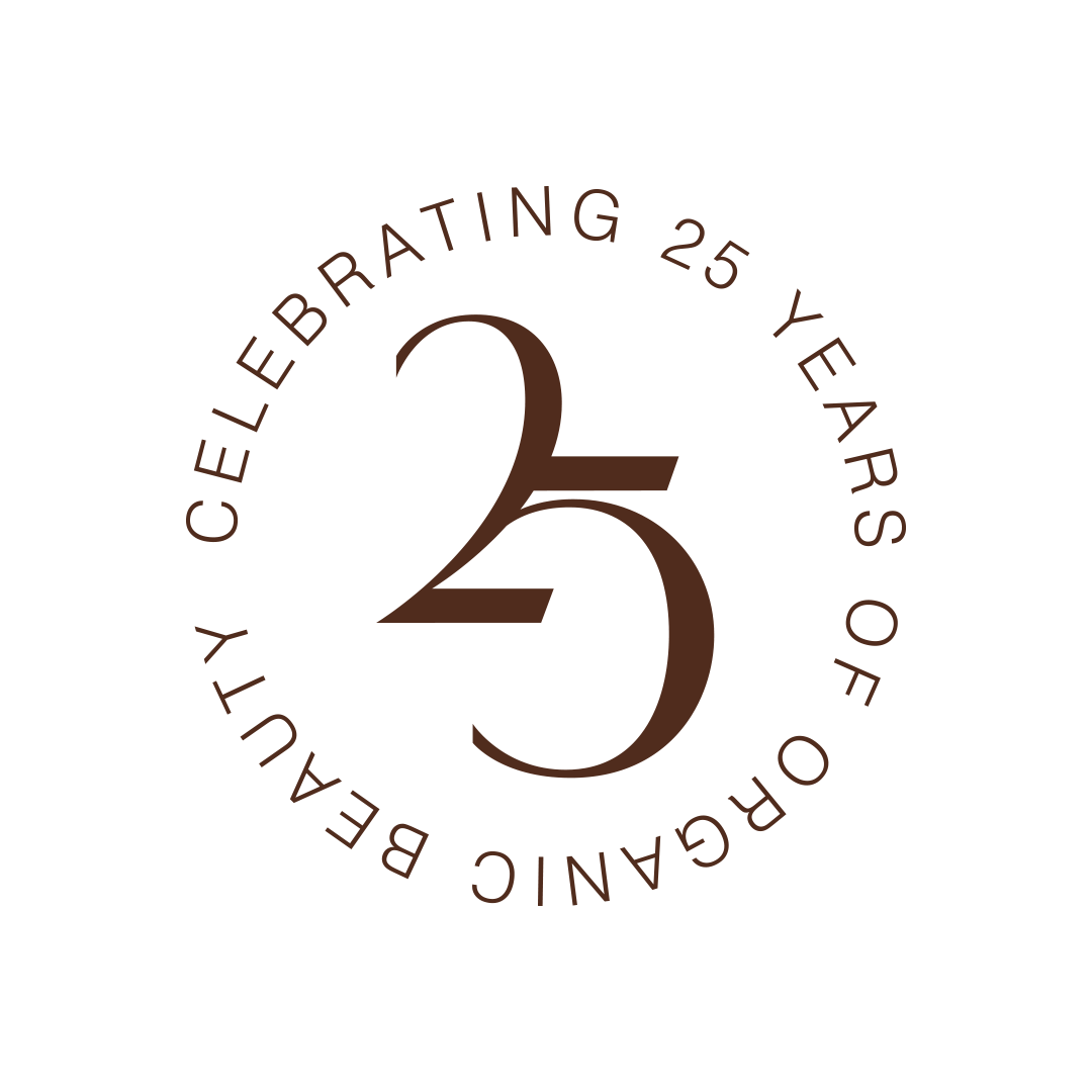
To celebrate John Masters Organics’ 25th Anniversary, I was asked to create and Instagrid that focused on the “Hero Ingredients” in our many well-loved formulas. The animated illustrations were a nod to the hands-on approach the entire team devoted itself to developing the products.
The winking/giggling eyes were inspired by the Quality & Assurance Manager, Natalie.
I designed and illustrated beer labels for a micro-brewery in Western Massachusetts. The first beer that I designed the label for was created to be paired with a local market that sells delicious fancy grilled cheese sandwiches. So the idea of the illustration is a gourmet cheese board. I made the board be a stylized version of their logo, in keeping with their early label concepts. After Cheesemonger’s, they asked me to design a few more labels. To see my process, click here.
SOFTWARE:
Adobe Illustrator, Adobe Photoshop, Pens, Pencils
CATEGORY:
Print, Consumer Packaging Labels
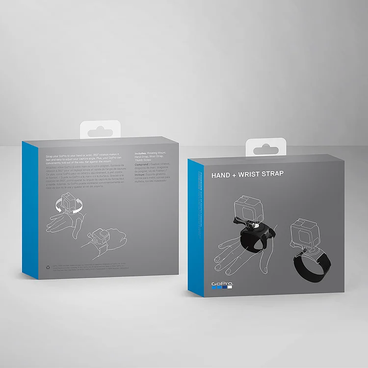
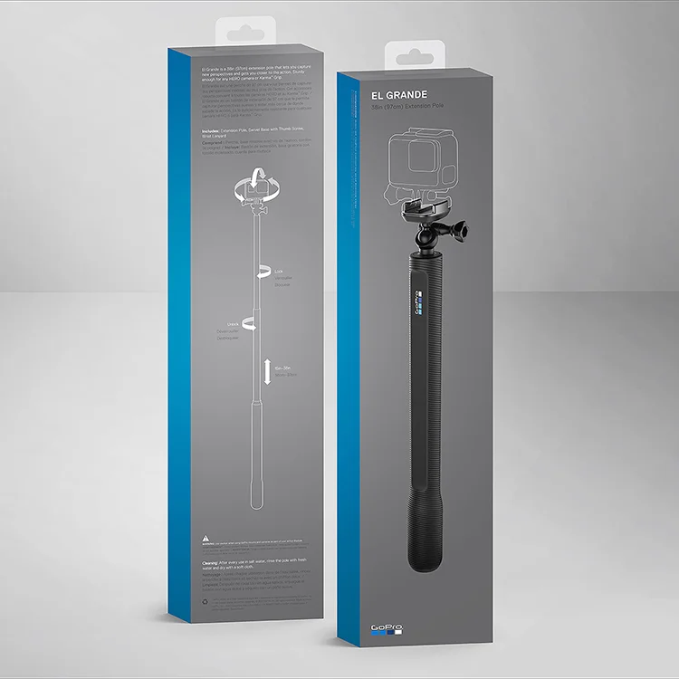
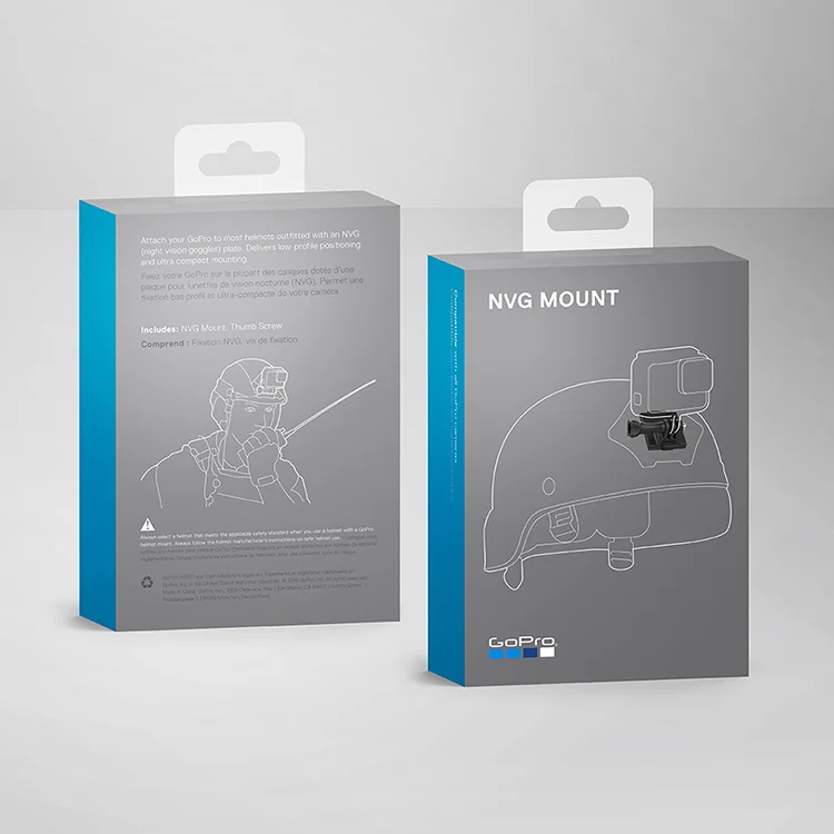
In 2017 GoPro was launching 5 Mounts + Accessories products in Spring, 4 Mounts + Accessories products in the Fall as well as the new HERO 6 Black camera, the updated HERO 5 Black camera and the HERO 5 Session camera.
The HERO 6 Black Camera packaging was to be completely revamped to be more environmentally friendly and compact. After 5 exciting months of collaborating with the creative director and art director to come up with the most innovative designs, 2 different size changes, more icon options than I could ever imagine, and completely wordless options, we went back to the tried and true jewel case. The HERO 5 Black and HERO 5 Session were updates of the previous year’s packaging, reflecting the cameras’ updates, as well as the new branding. In addition I designed the warranty booklets and quick reference guides for over 26 languages.
The accessory boxes needed to convey fun and excitement that is synonymous with GoPro, as well as the prestige look and feel of the new brand. I compared angles of cameras and directions of helmets, and familied the fronts to live harmoniously with the packages from the previous launch. Then I came up with the concepts for the illustrations on the backs, sometimes reflecting what the product could do, sometimes showing how it would be used, and sometimes showing whimsy. Finally I art directed the illustrator to get the line drawings just right.
SOFTWARE:
Adobe Illustrator, Adobe Photoshop
CATEGORY:
Print, Consumer Packaging
These are a few samples of brand identities I have designed. The first three comprise a series of logos that I created for an entrepreneur in Washington, DC, who was starting a variety of service companies. He’s an avid sailor, so he requested there be a subtle “Modern Nautical” theme to the identities, even though all three business had nothing to do with sailing. The Faller Real Estate logo represented their “nimble and always moving forward” approach to their business.
SOFTWARE:
Adobe Illustrator, Adobe Photoshop, Adobe InDesign, Pens, Pencils
CATEGORY:
Branding, Marketing
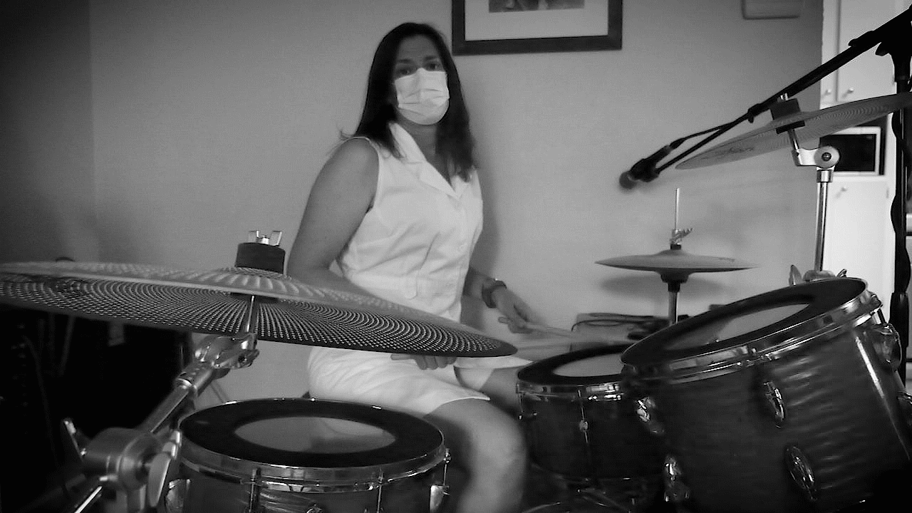
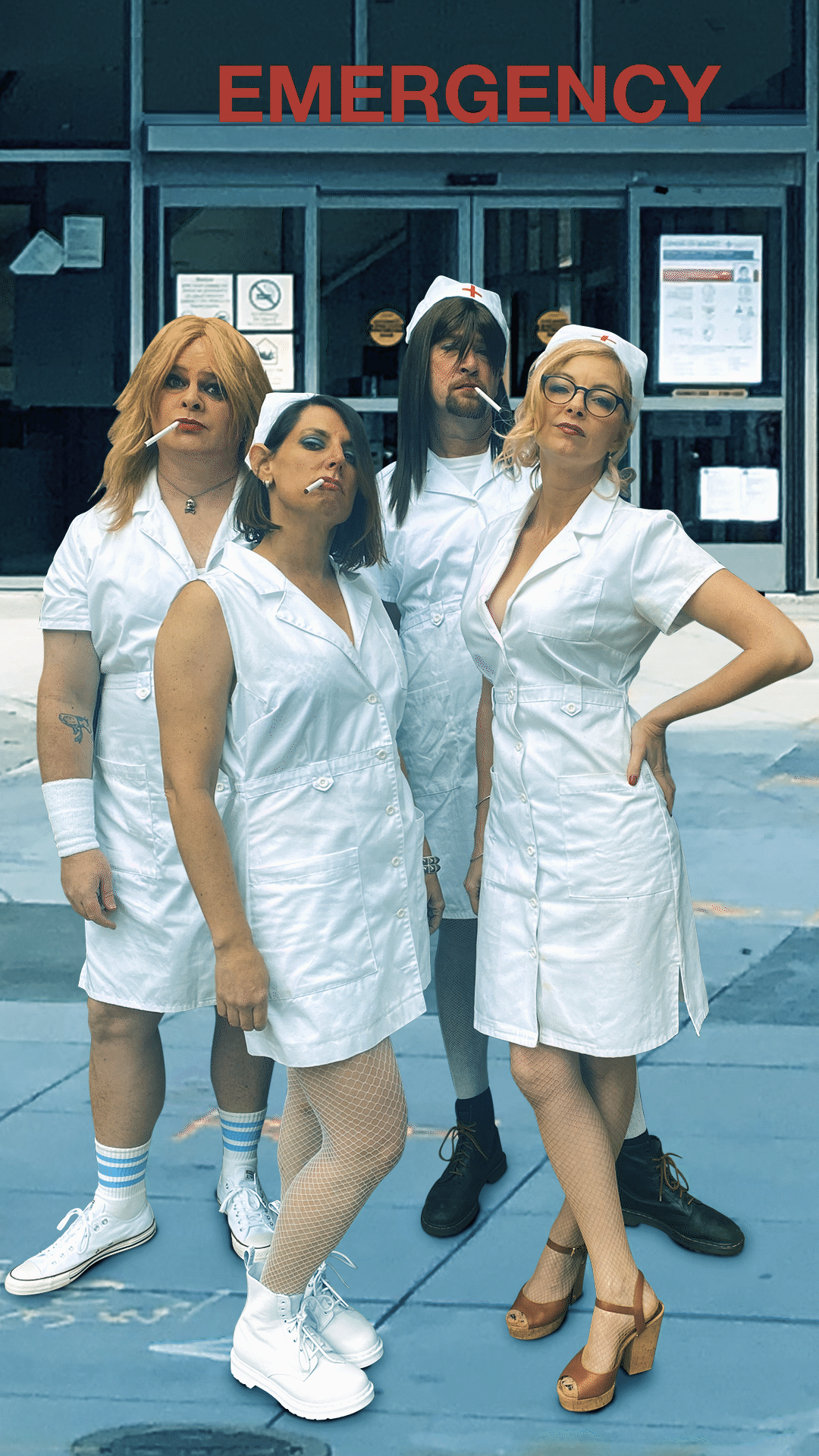
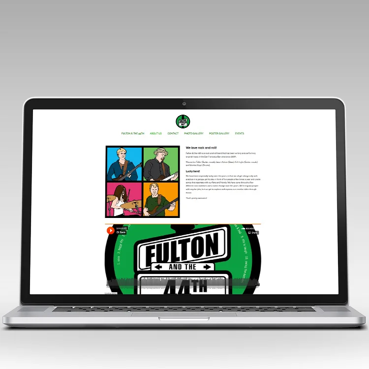
My favorite part of being in a band is performing on stage. Second to that is getting to design the logo, stickers, flyers and posters for gigs and the website.
SOFTWARE:
Adobe Illustrator, Adobe Photoshop, Adobe AfterEffects, Panasonic Lumix Camera, Pens, Pencils, Squarespace
CATEGORY:
Print, Digital, Web
Buttons, pins, hand soap label, and of course stickers.
Promo animation with text for Spongebath.
Button logo, posters and album. Check out the album here.
At Applied Biosystems my team was constantly working on evolving the brand. We did explorations and brand workshops. When a new product was being launched, we had to brand it. This included an overall look and feel for printed material and online. Take a look at my process for this project.
SOFTWARE:
Adobe Illustrator, Adobe InDesign, Adobe Photoshop
Brochure
Folder and white papers
Tradeshow Properties
A fun, yet overpriced idea