John Masters Organics is a beauty company founded in 1994 in New York City by salon owner and hairstylist to the stars, John Masters. His principles were to use natural or organic ingredients that he got from his local farmers market. Fast-forward nearly 25 years, and the brand had gone through quite a few revisions. I joined the John Masters Organics team during a huge brand overhaul in 2017, and my first project was the redesign of the beloved Lip Calm tubes.
Lip Calm tube redesign

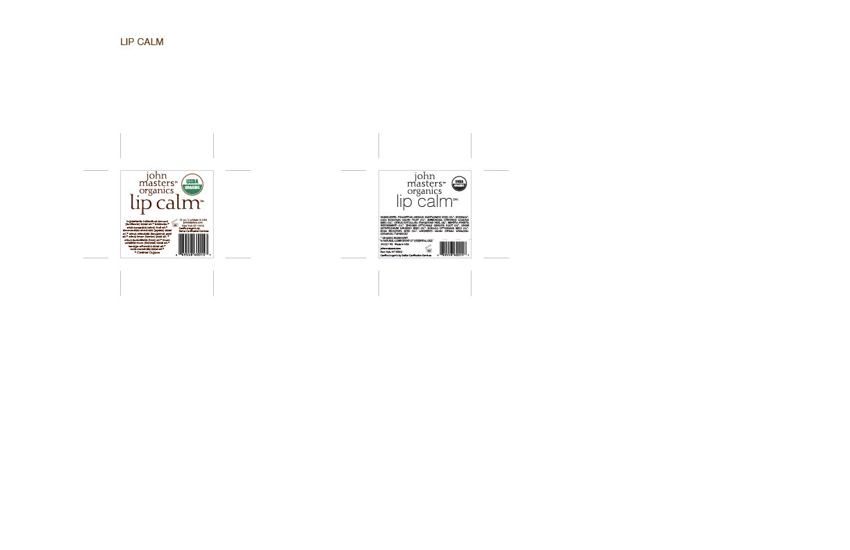
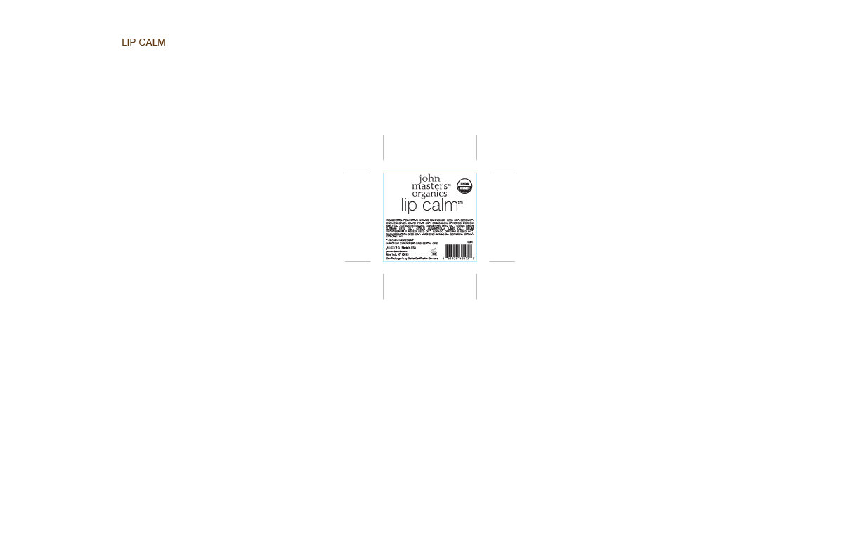
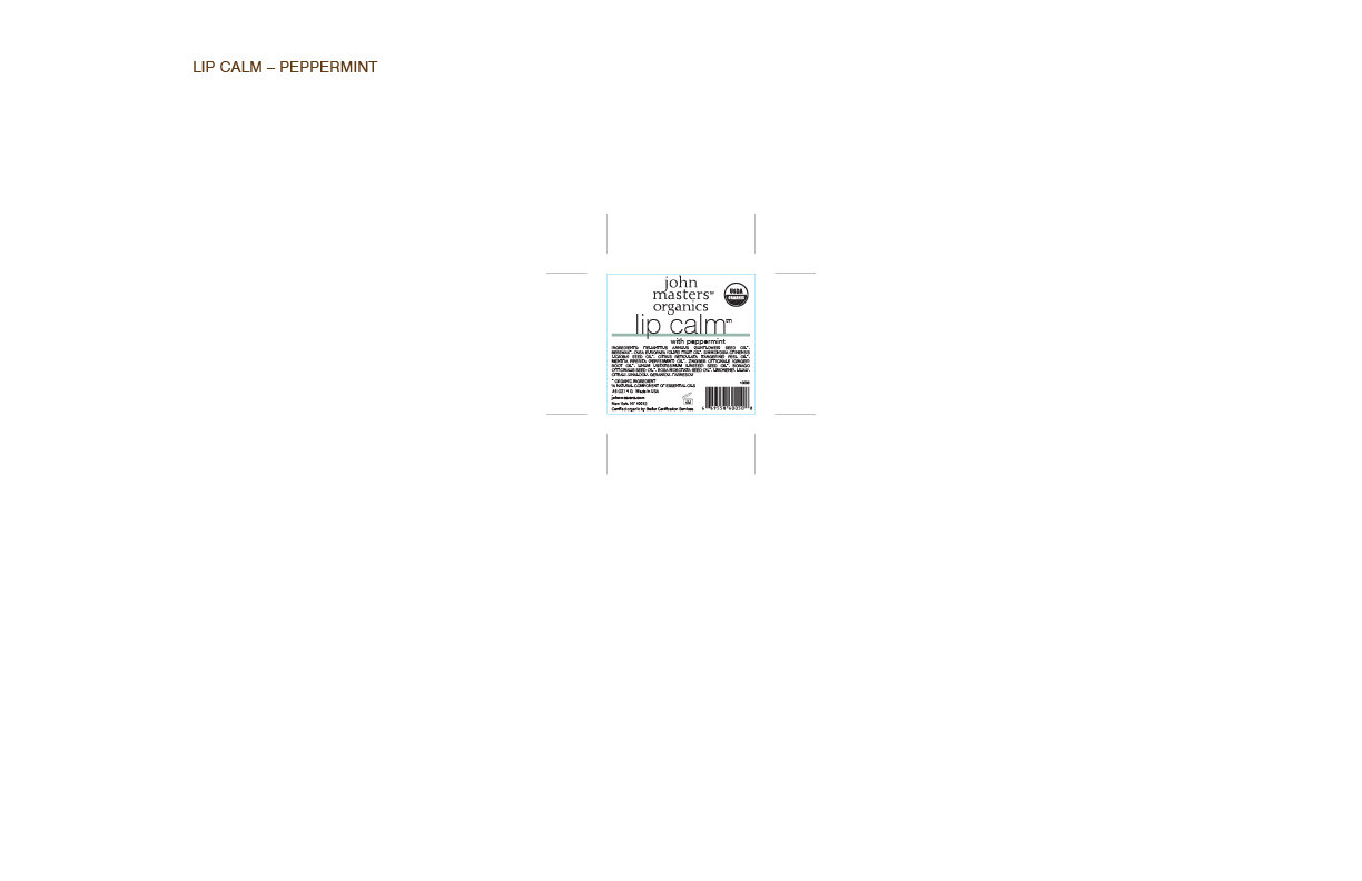
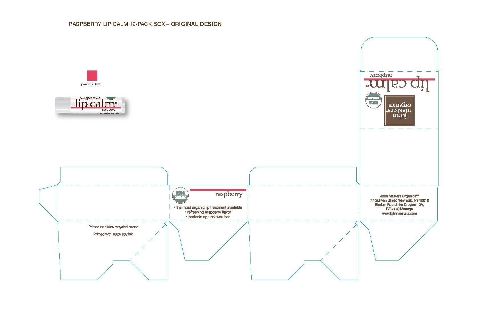
Original Lip Calm Tubes
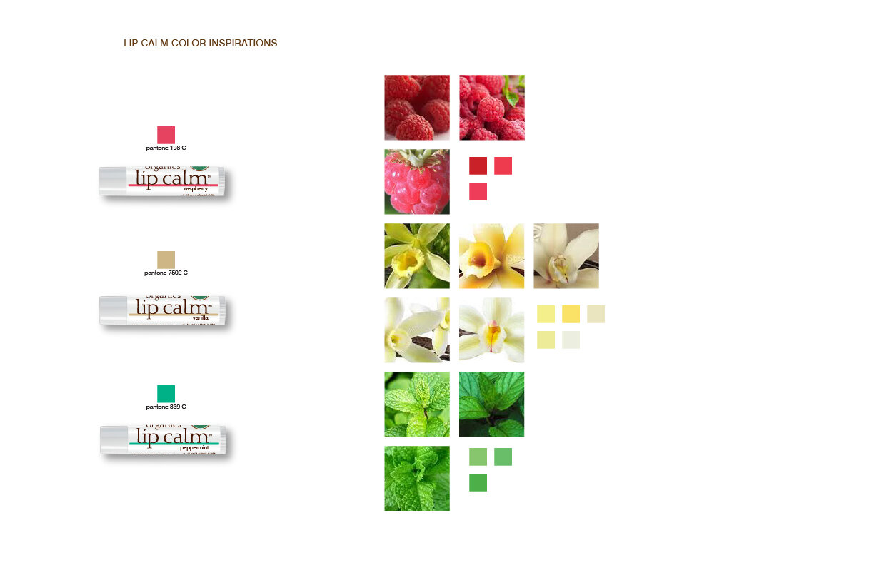

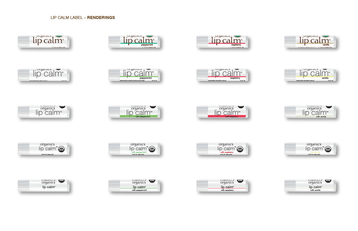
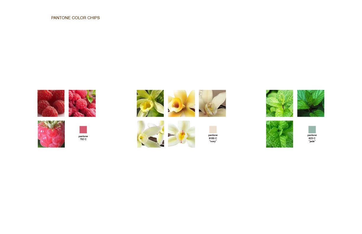
For my first presentation to the team, I explored some color options, based on inspiration from the ingredients, as well as what was on the tubes at that time. Because the packaging was changing on all products, I thought that the fonts should be the sans serif that we were using on the shampoo and conditioner bottles to maintain consistency and elegance across the brand. I also explored thicker and thinner lines under the name. The team selected a design direction that kept the line thickness and font size similar to the original, but wanted more color options.

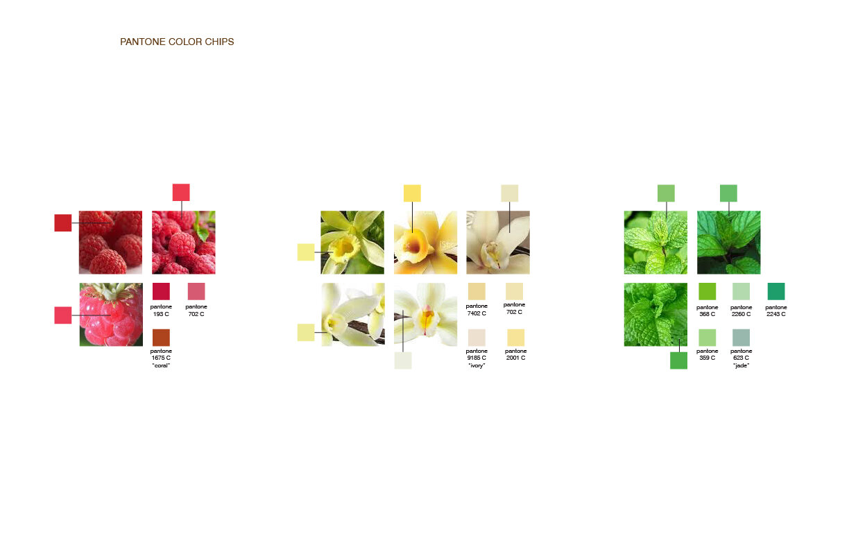
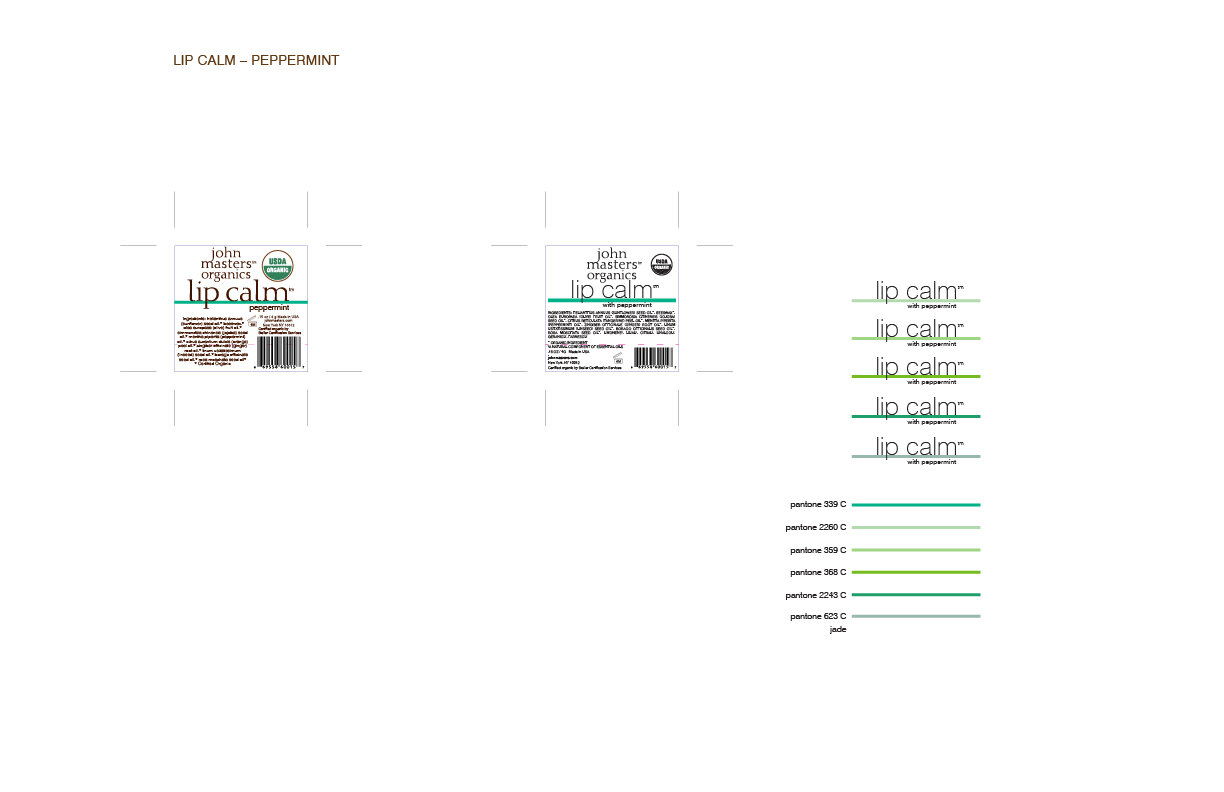
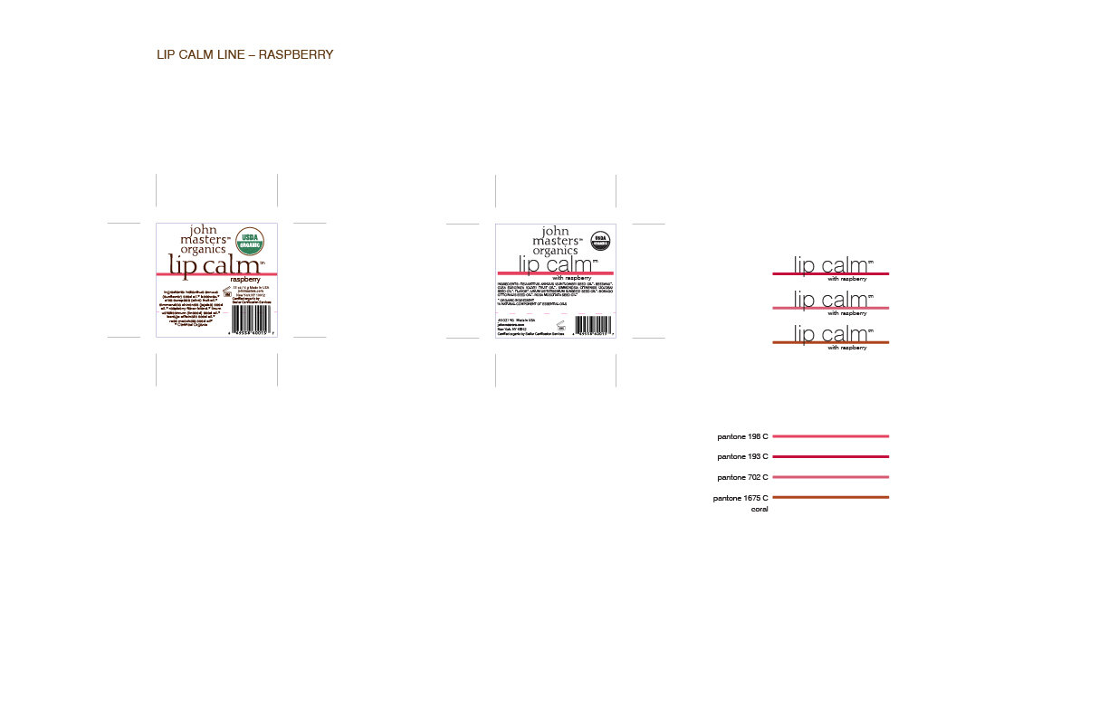
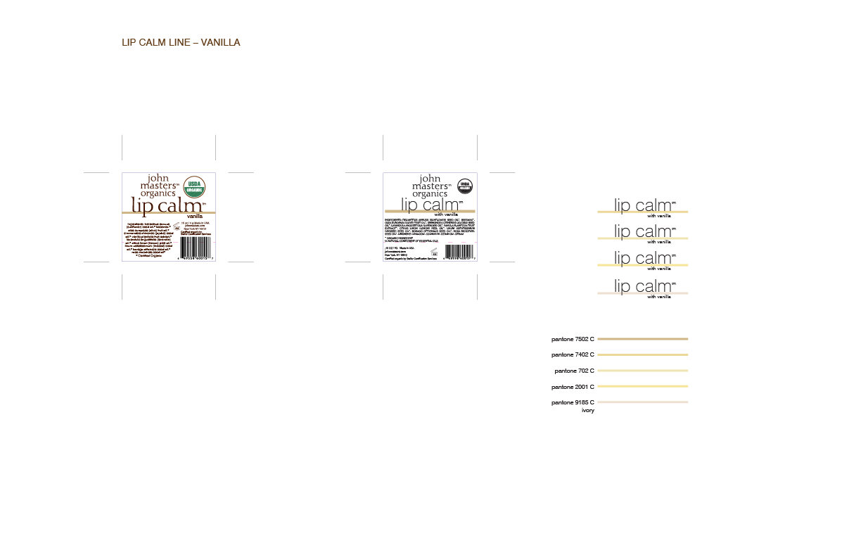
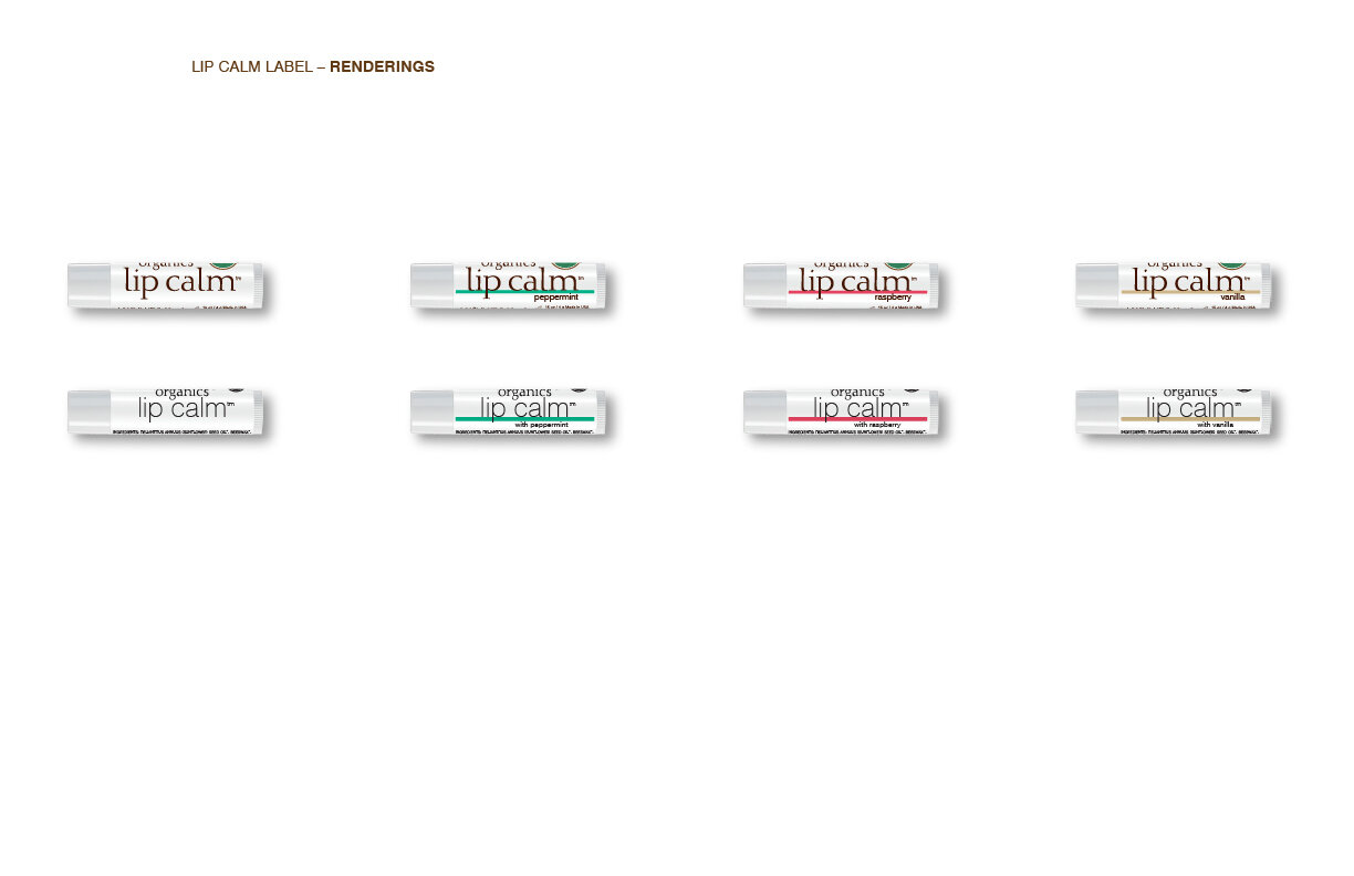
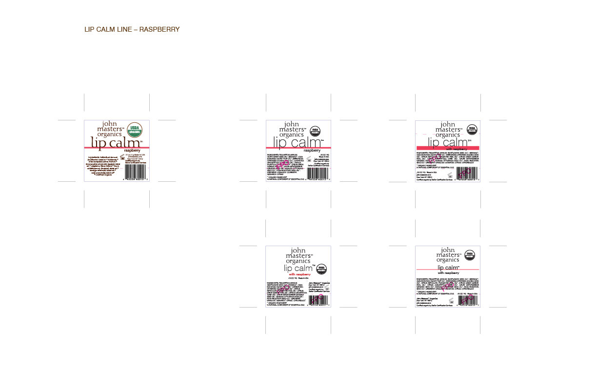
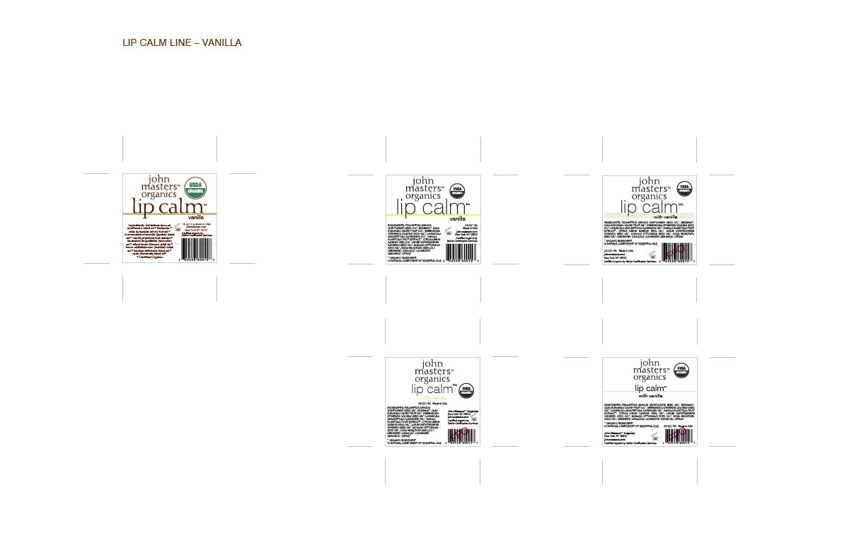
In my second presentation I presented the design that the team chose, and dove deeper into the color options, reminding them of the imspiration, but showing a variety of PMS options, along with the color chips for them to choose from. Fortunately, the Peppermint and Vanilla color options were very close to the jade and ivory from our new color palette, so we redirected that way, but the coral in the palette was a bit too orange, and didn’t really say “Raspberry”, so the team picked PMS 702.
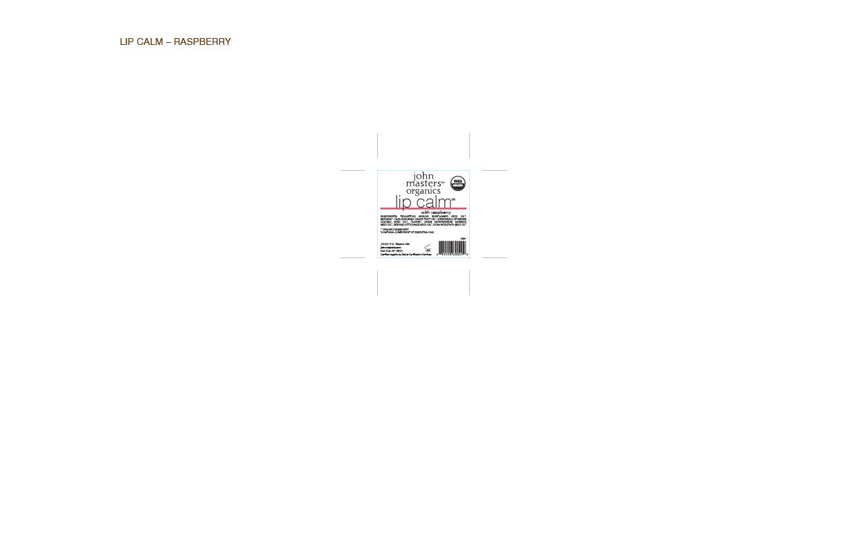
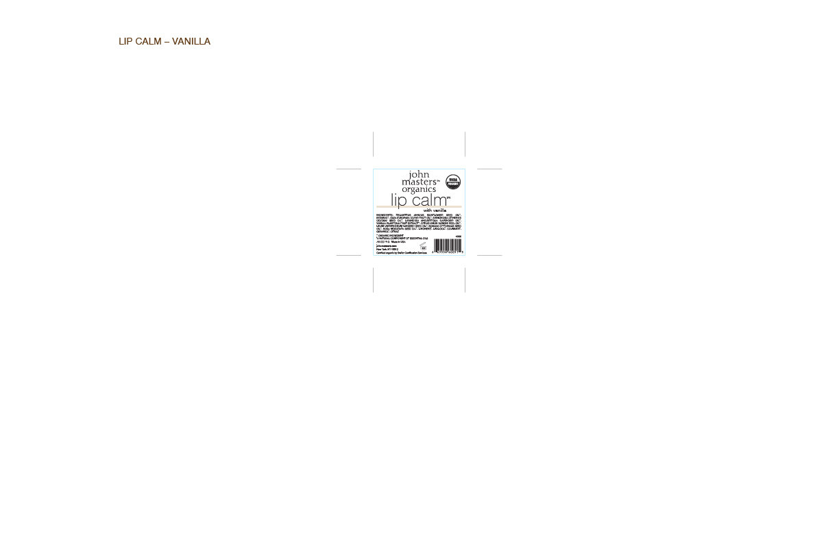
I showed the team one final presentation to ensure that the colors and designs were exactly what they wanted.

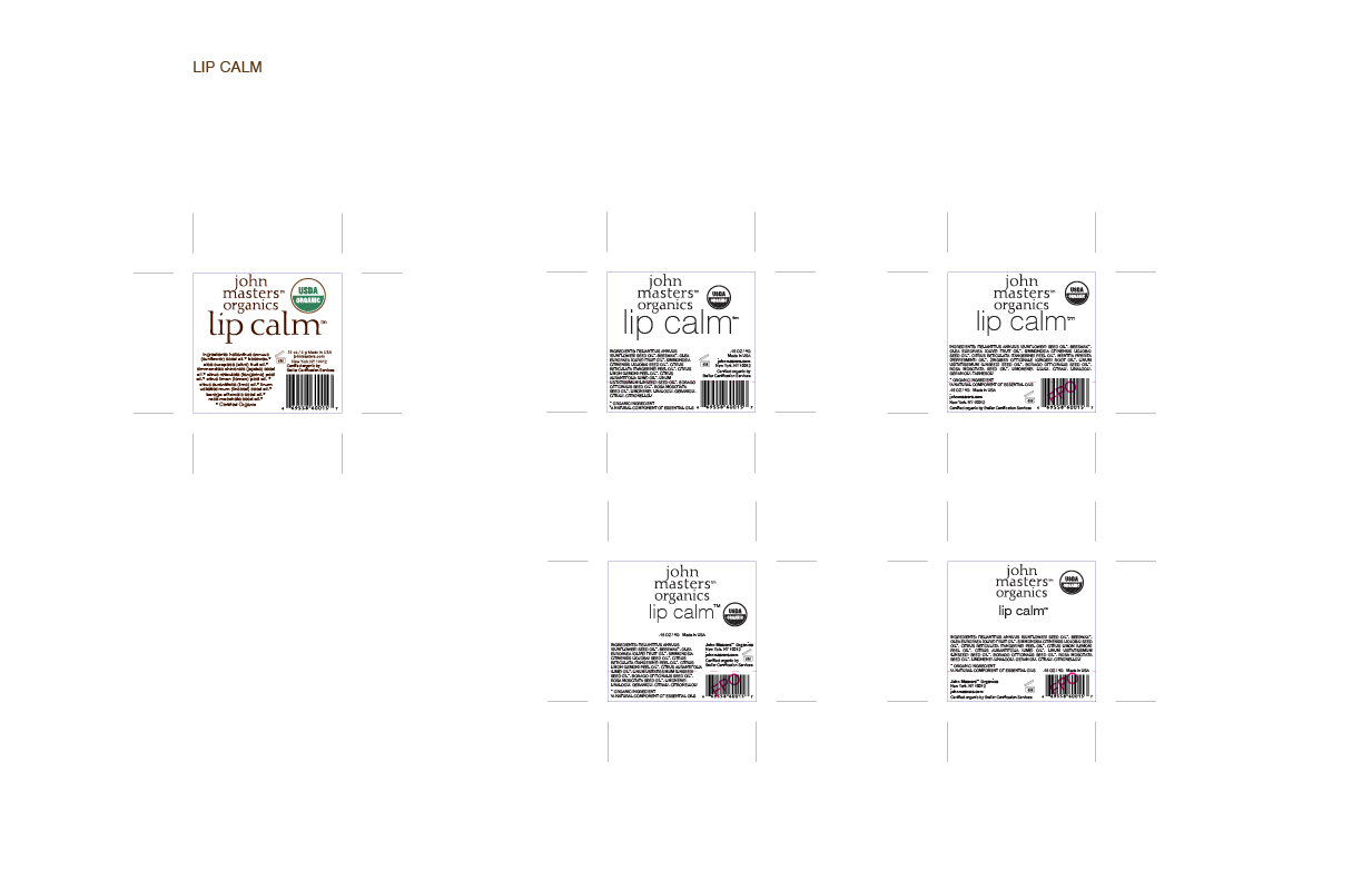
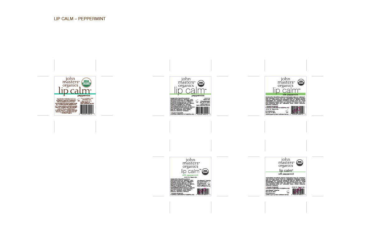
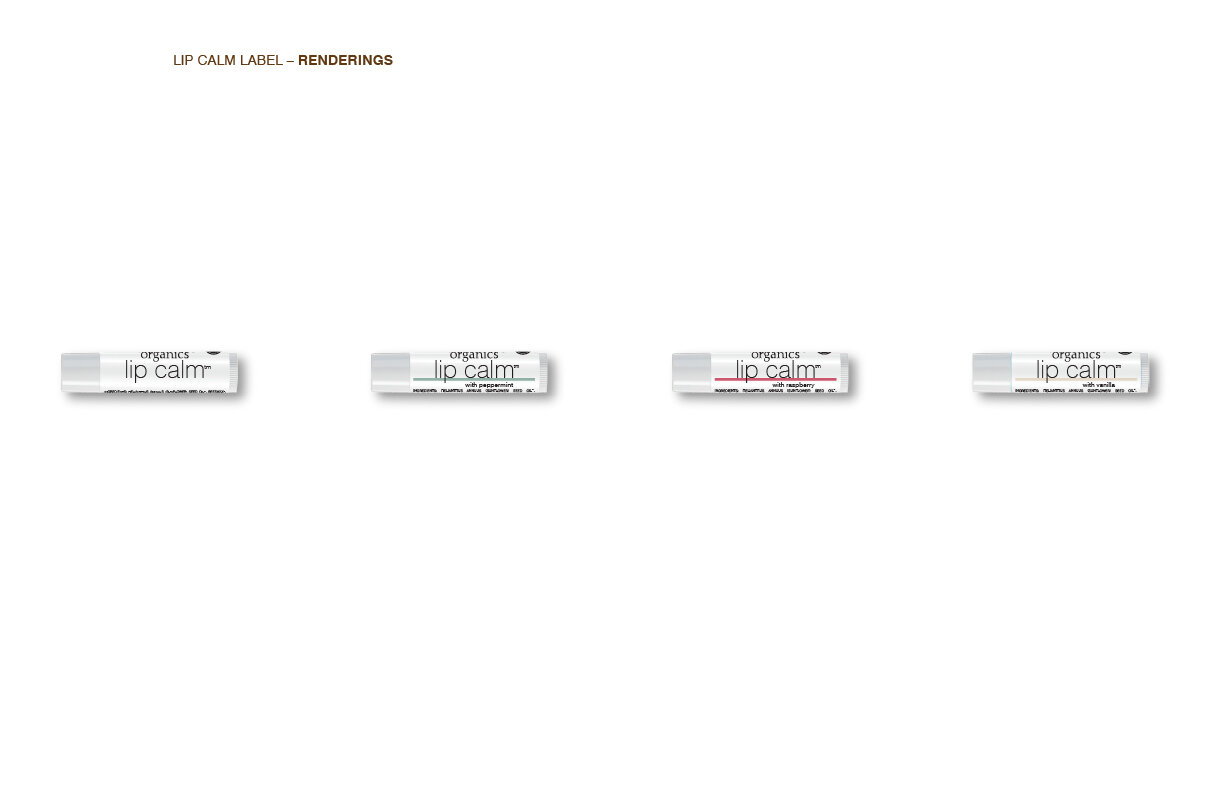
Redesigned Lip Calm Tubes
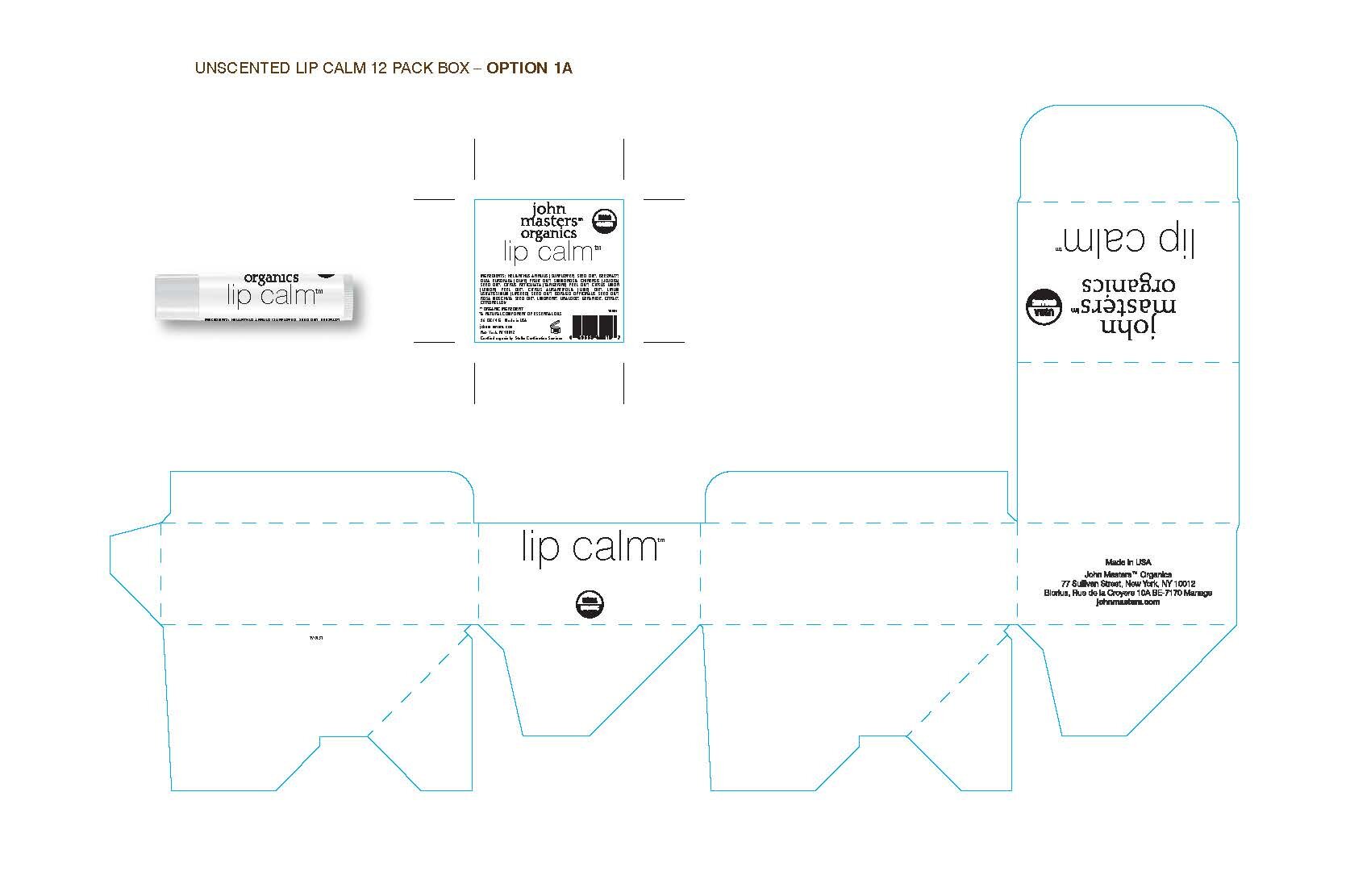
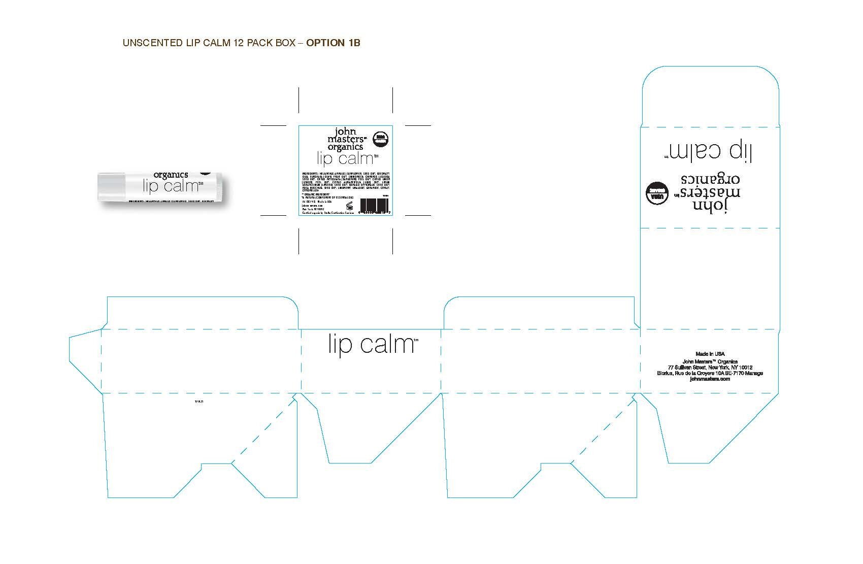
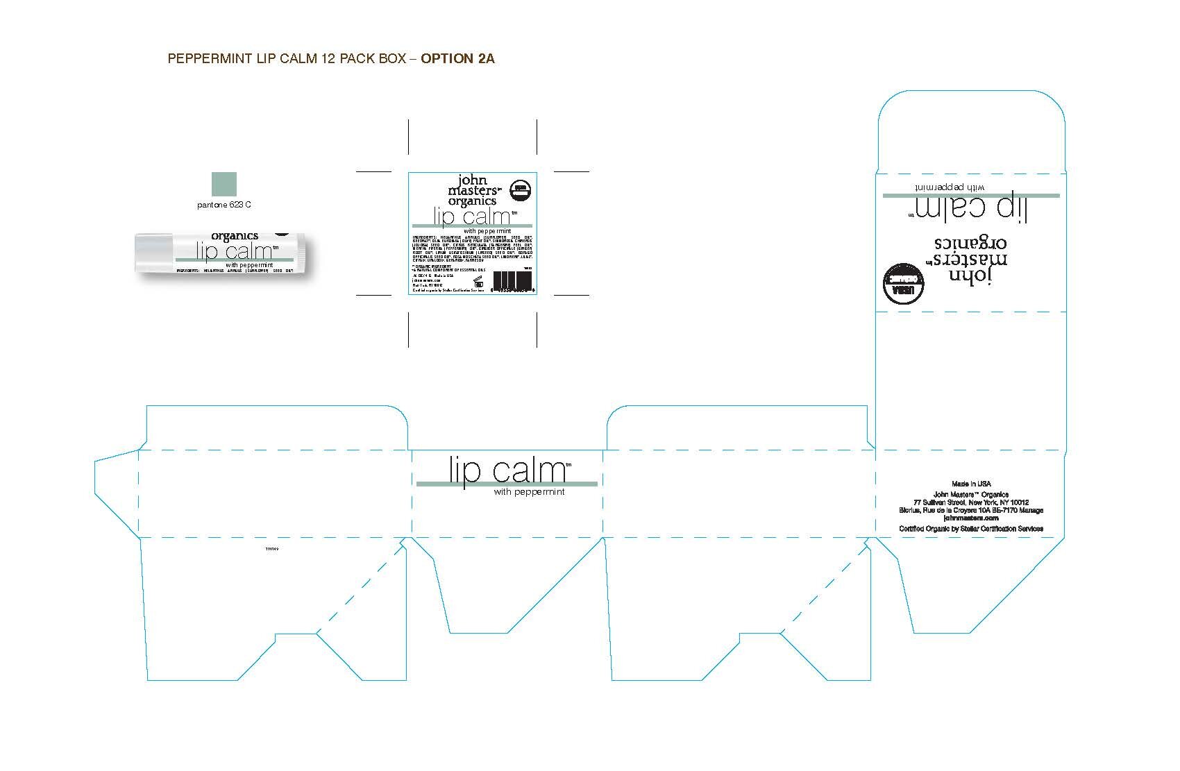
Lip Calm 12-Pack display box redesign
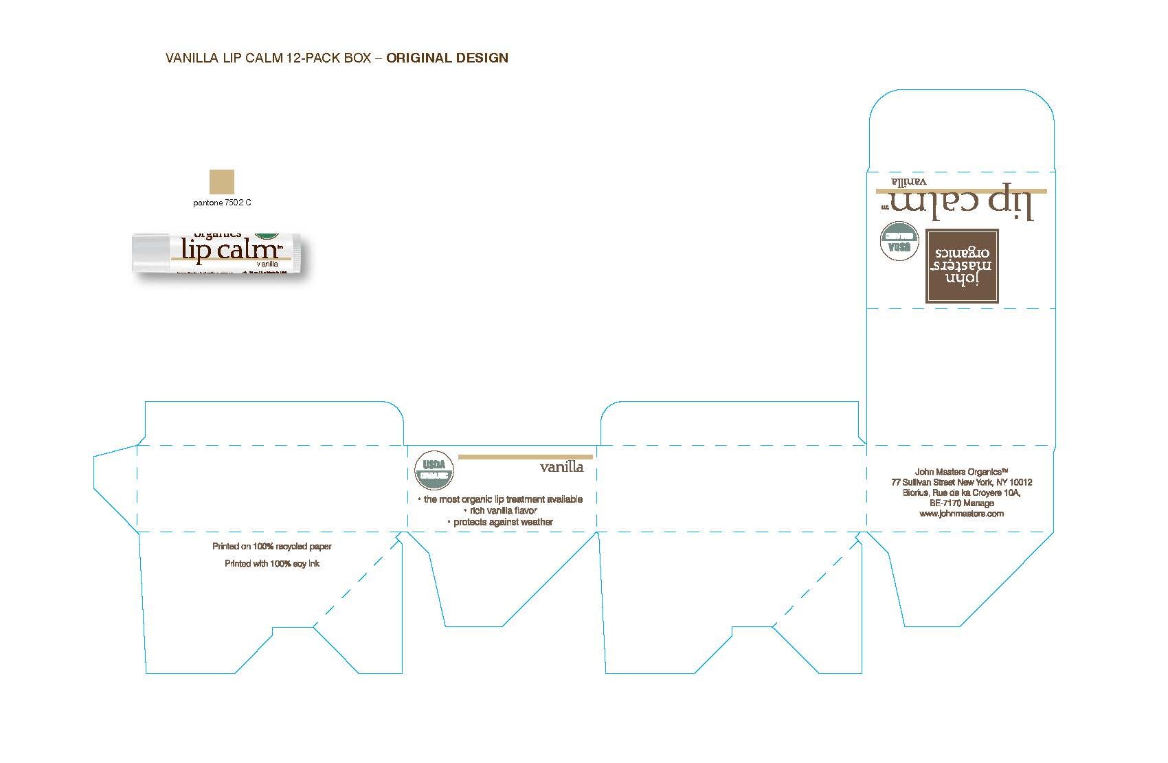
The Lip Calm tubes are packaged in a box that hold 12 tubes and is used as a display in stores. I was also asked to update these boxes. I wanted to update the paper stock of the boxes at the same time, but sourcing new stock would have made us miss the launch, so we kept them matching the recycled look of skincare boxes. These boxes were never meant to be sold as a 12-pack, but starting in late 2018 the limited edition Lip Calms were available to be sold in the boxes.
Original Vanilla Lip Calm Box and Tube
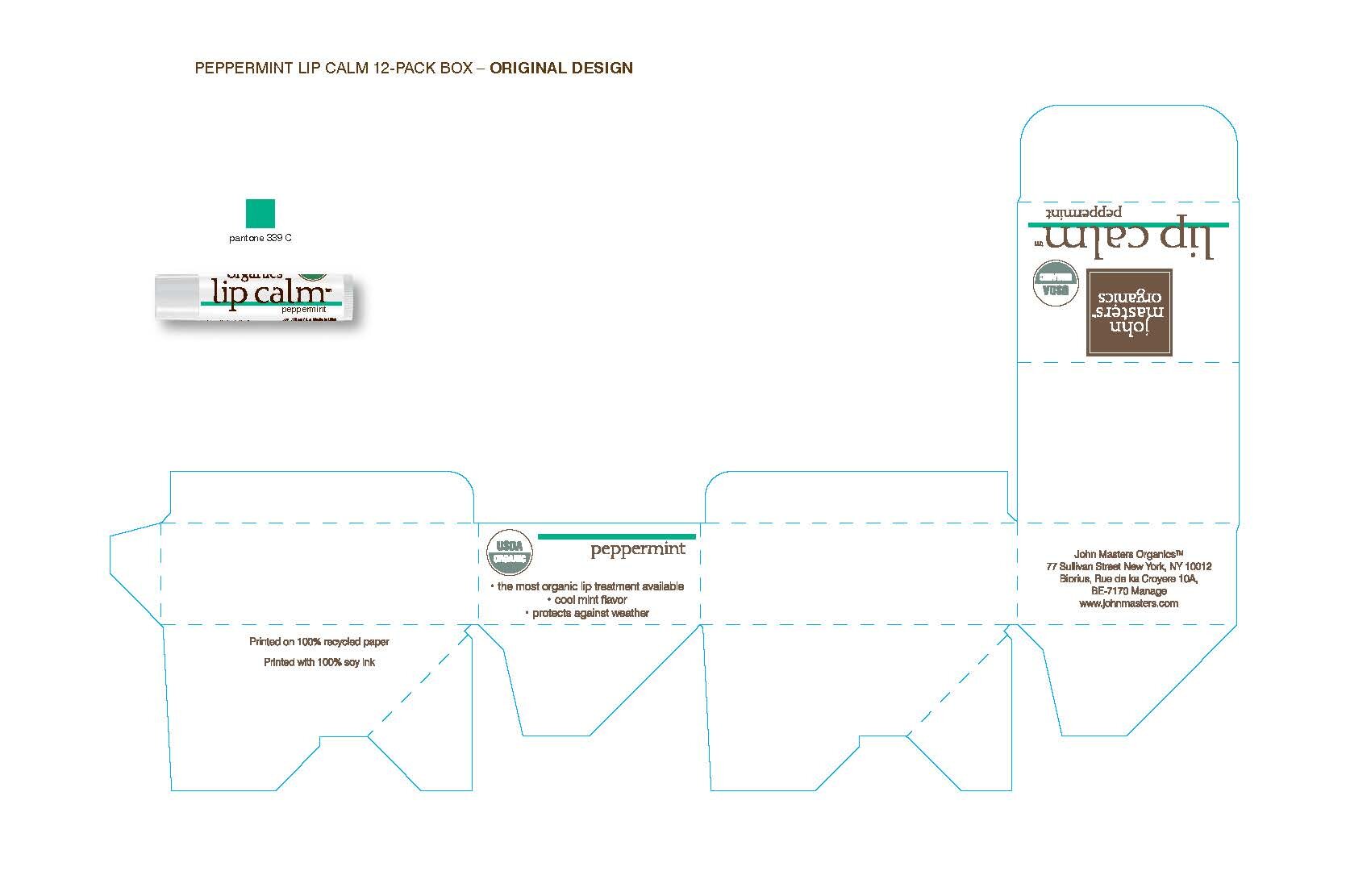
Below is the first presentation after the tube designs had been finalized.
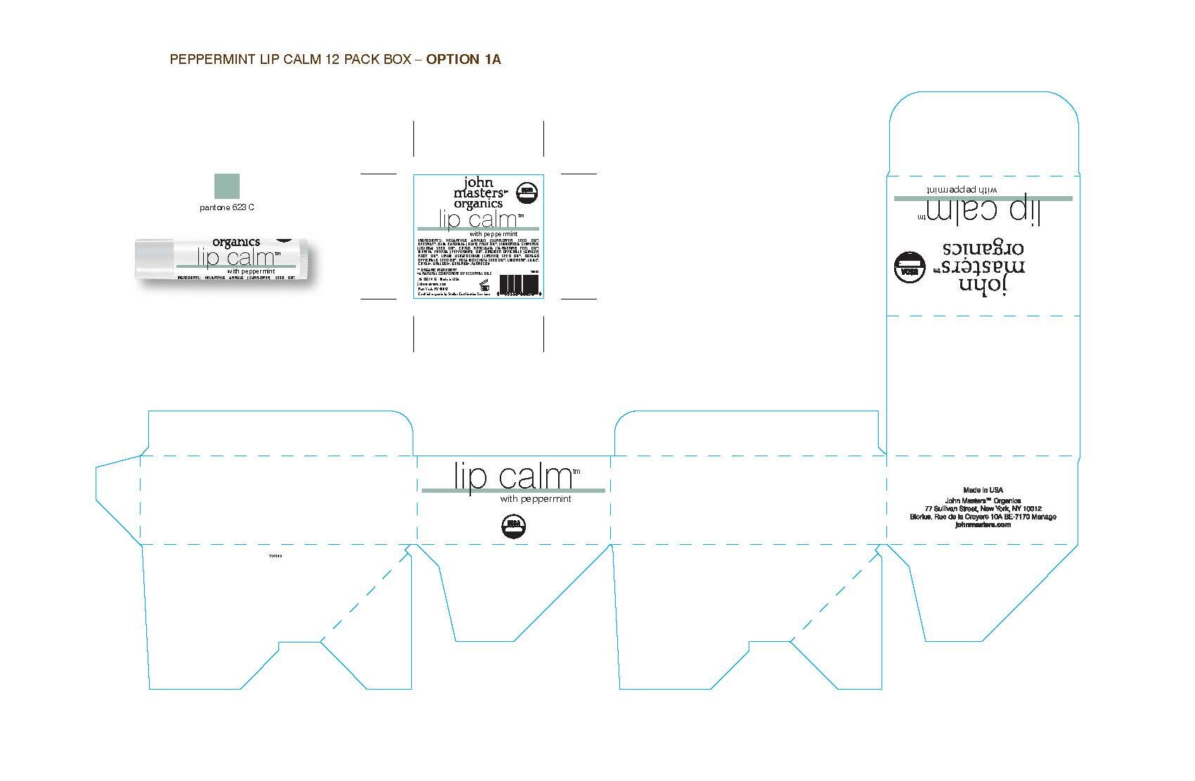


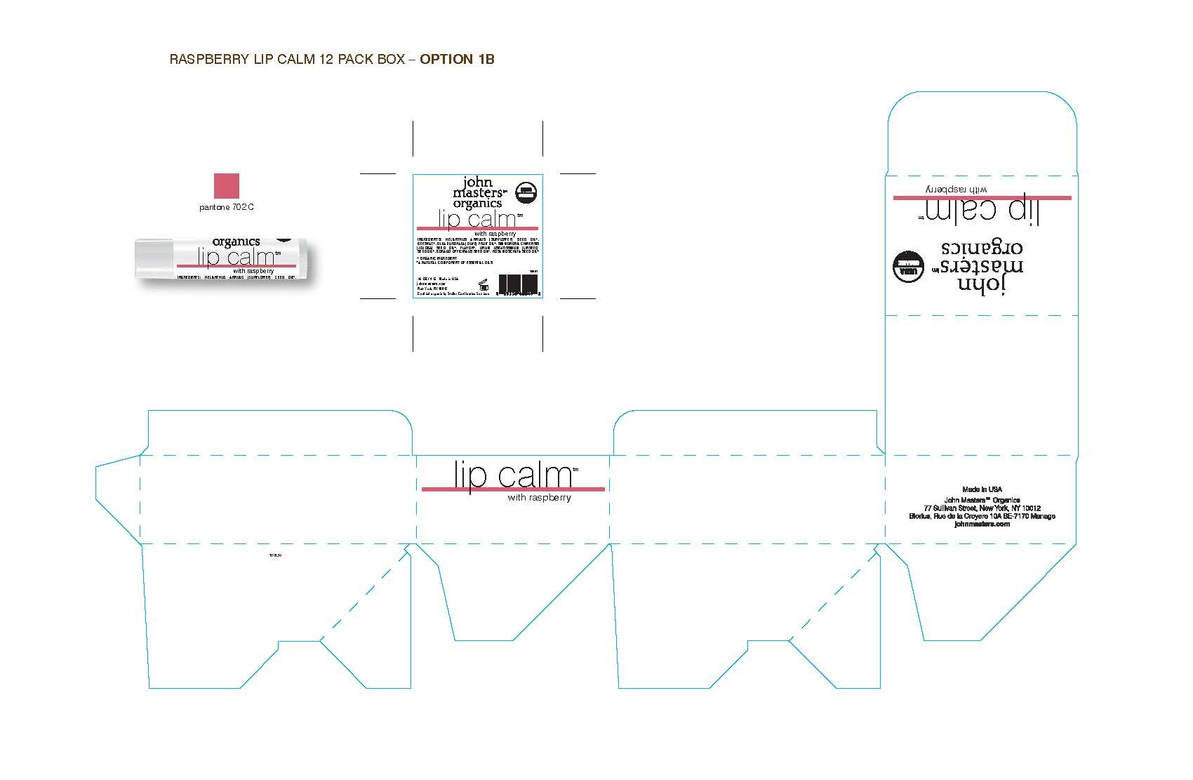
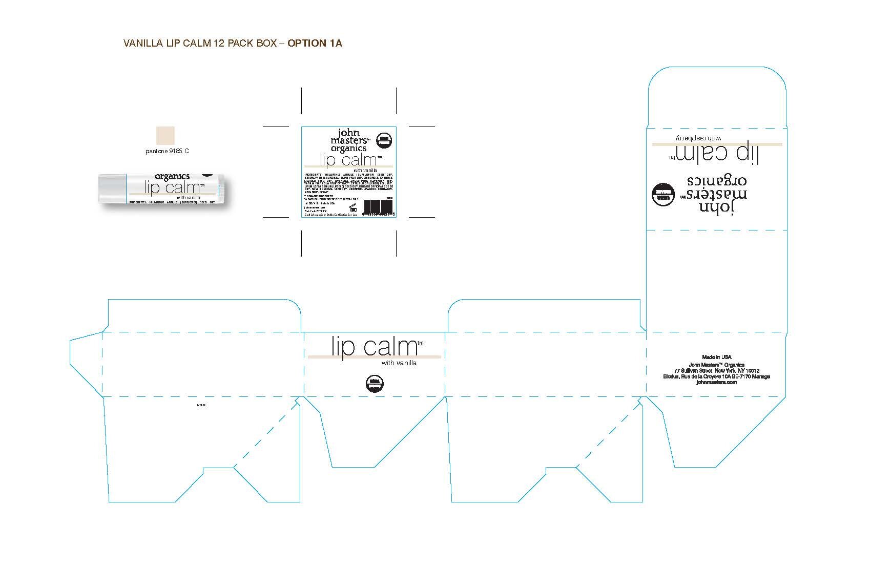

I simplified the boxes by limiting the amount of copy that was on the panels. This way the flavor was the hero. I also used the logo that was not in a brown box, in keeping with the brand update.
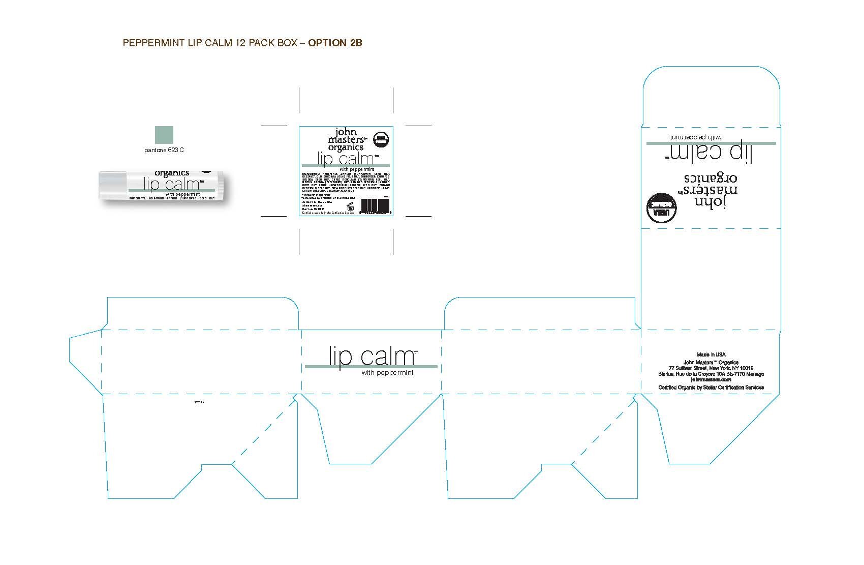
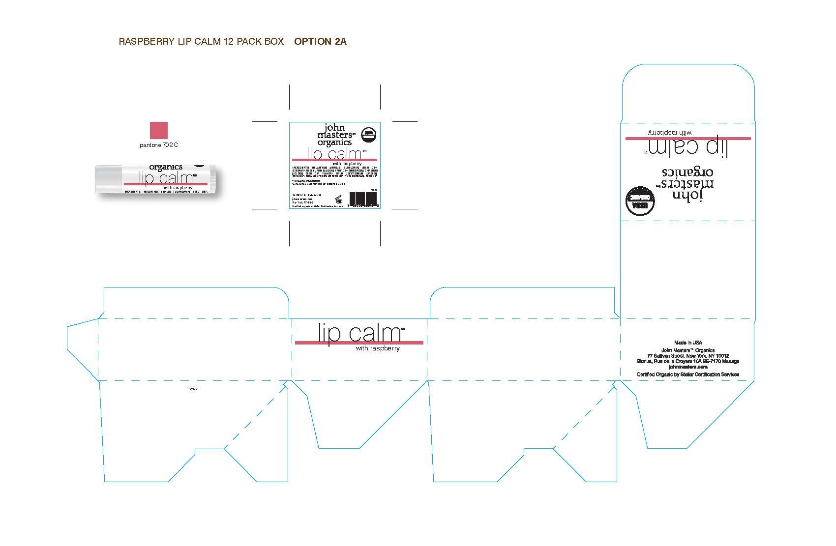
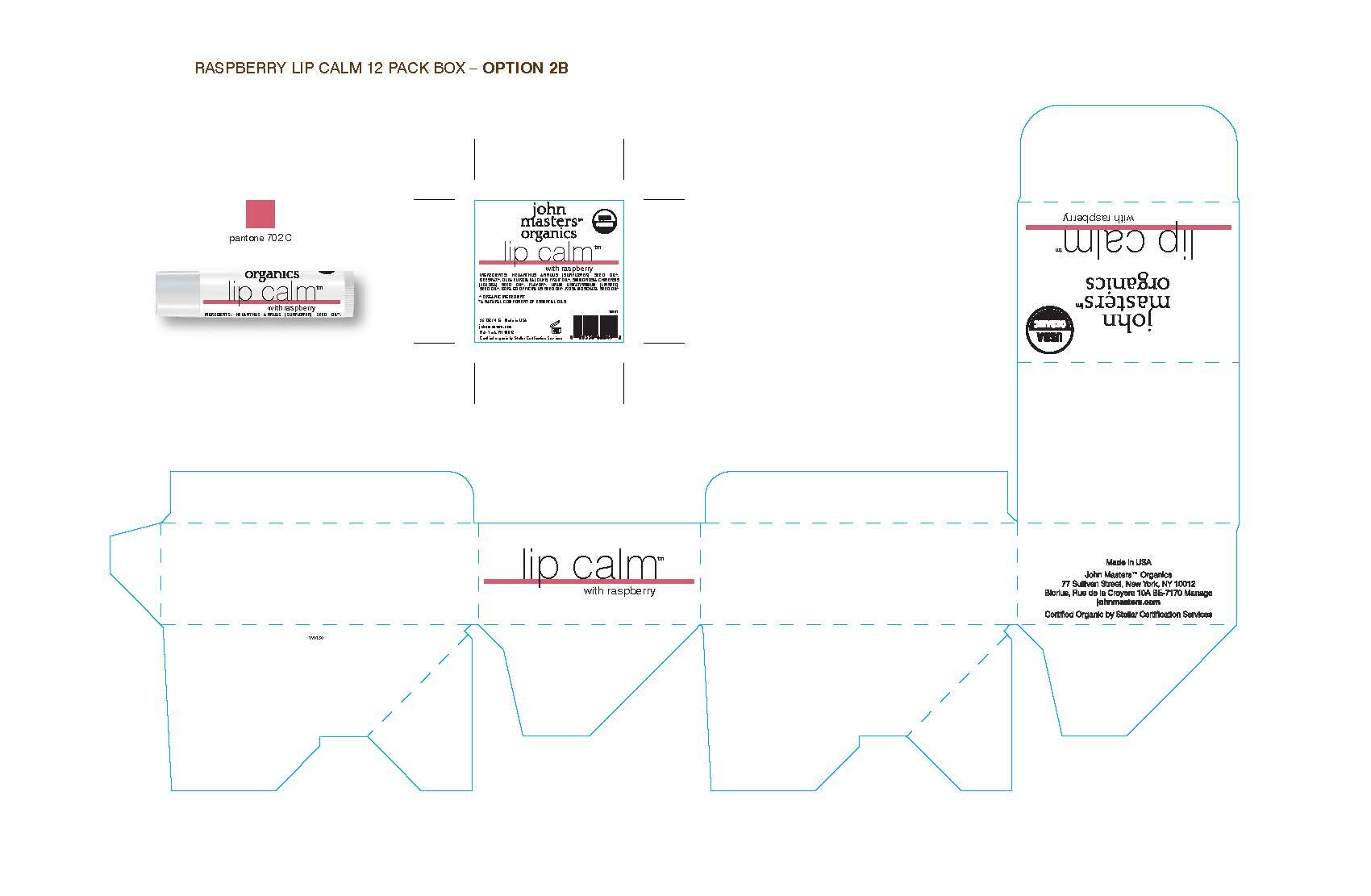
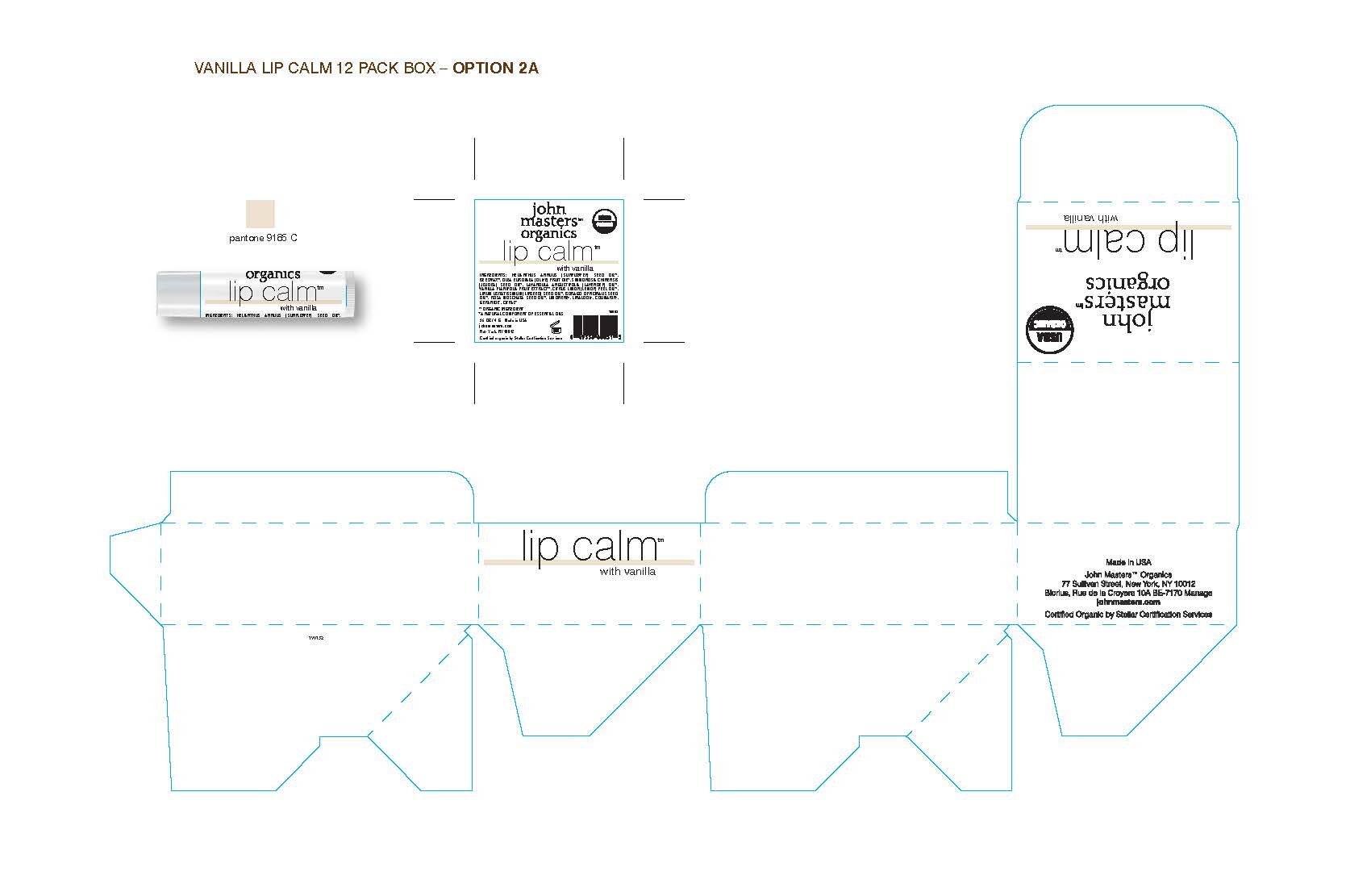
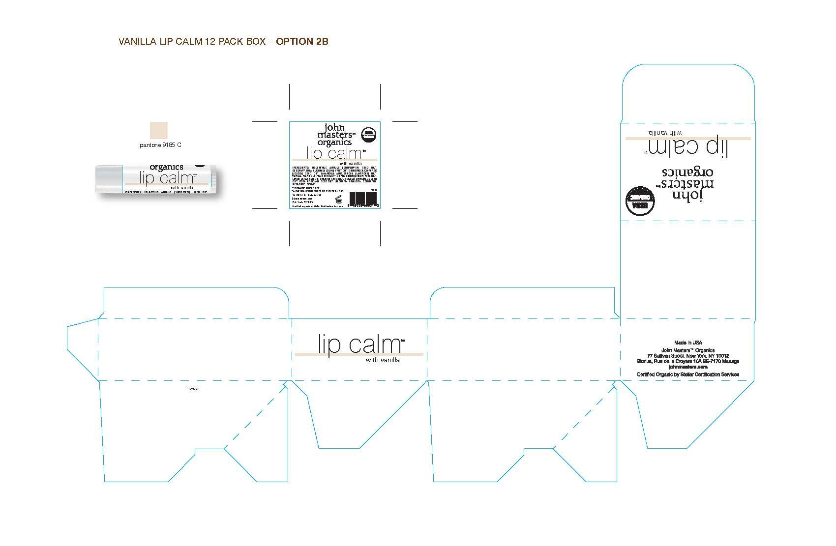
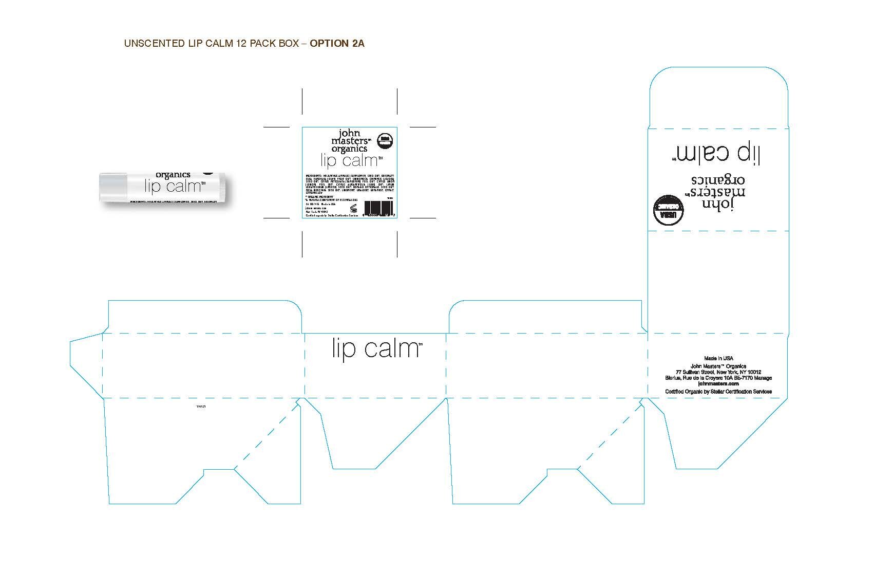
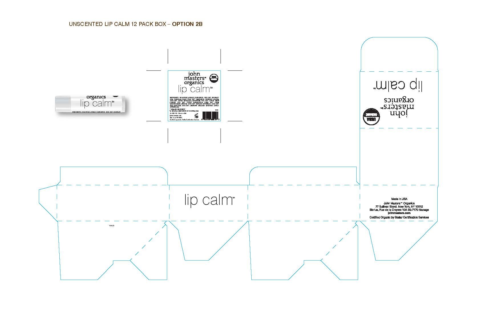
In my second presentation I enlarged the USDA logo to be more prominent and offered 2 options for the location of the name on the front panel. The placement in the center of the front panel was chosen.
Redesigned Vanilla Lip Calm Box and Tube
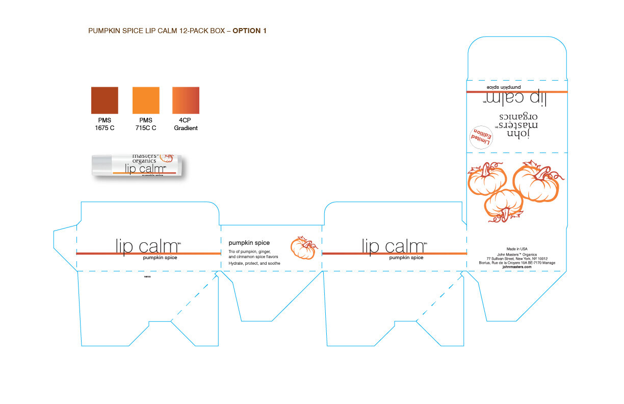
LIMITED EDITION PUMPKIN SPICE LIP CALM TUBE AND BOX DESIGN
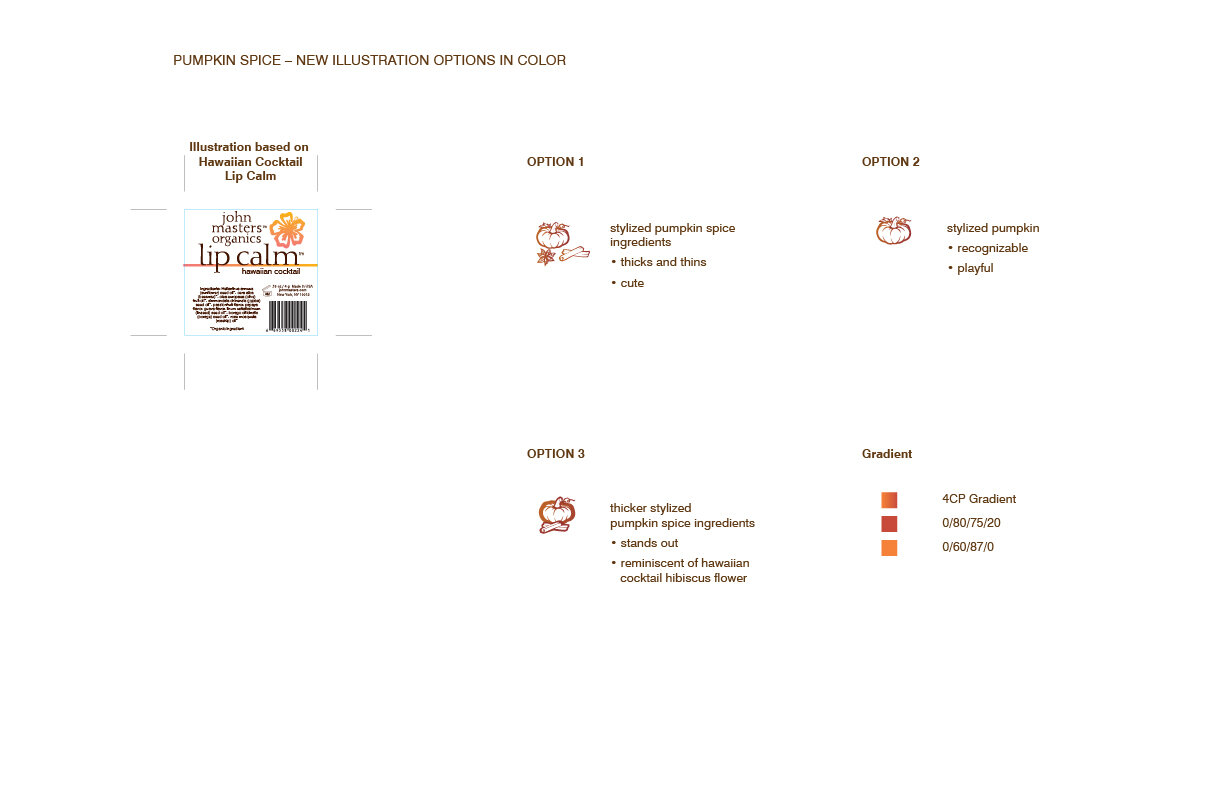
The Limited Edition Lip Calms were a new adventure for John Masters Organics. When I started working at John Masters Organics the only limited edition flavor was exclusive to the new Ala Moana store in Hawaii, the Hawaiian Cocktail Lip Calm. When I was asked to design a label for the Pumpkin Spice Lip Calm, I looked to the Hawaiian Cocktail Lip Calm for inspiration both in color and illustration style, but with the new look and feel of the 4 standard Lip Calms.
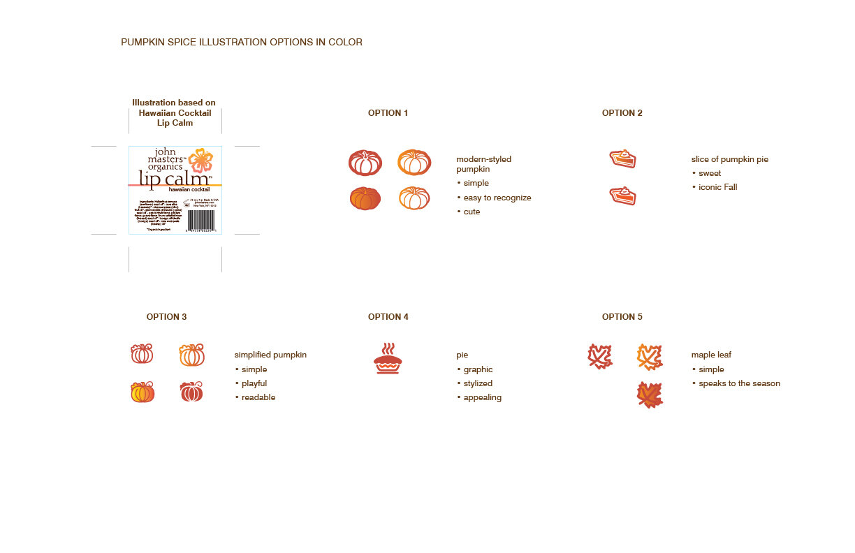
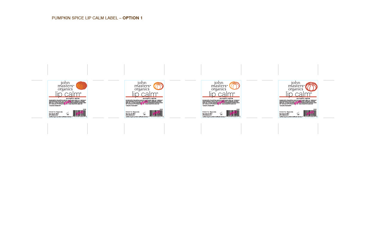
I offered 5 illustration options for my first design round, keeping a simple, whimsical style with an Autumnal/Thanksgiving theme. The coral color from the new brand palette fit the theme nicely and I selected an orange that would compliment the coral, creating a gradient that would really stand out on the shelf.
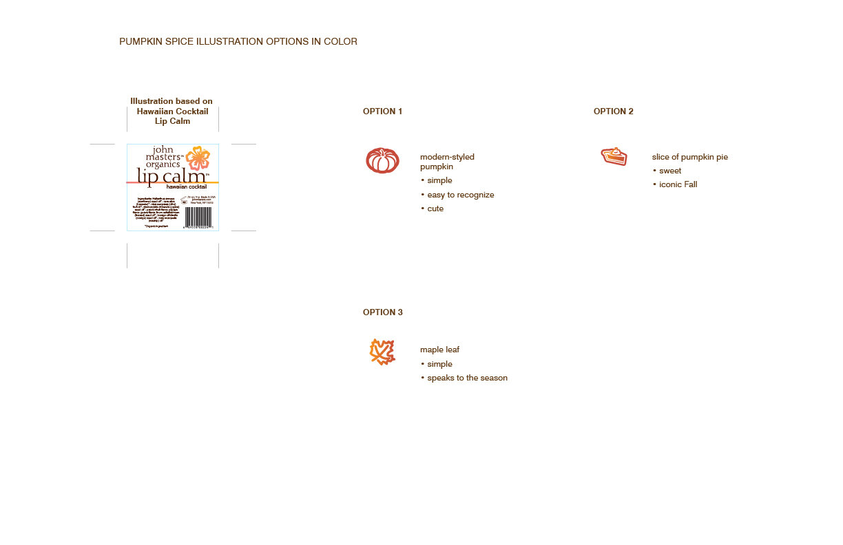
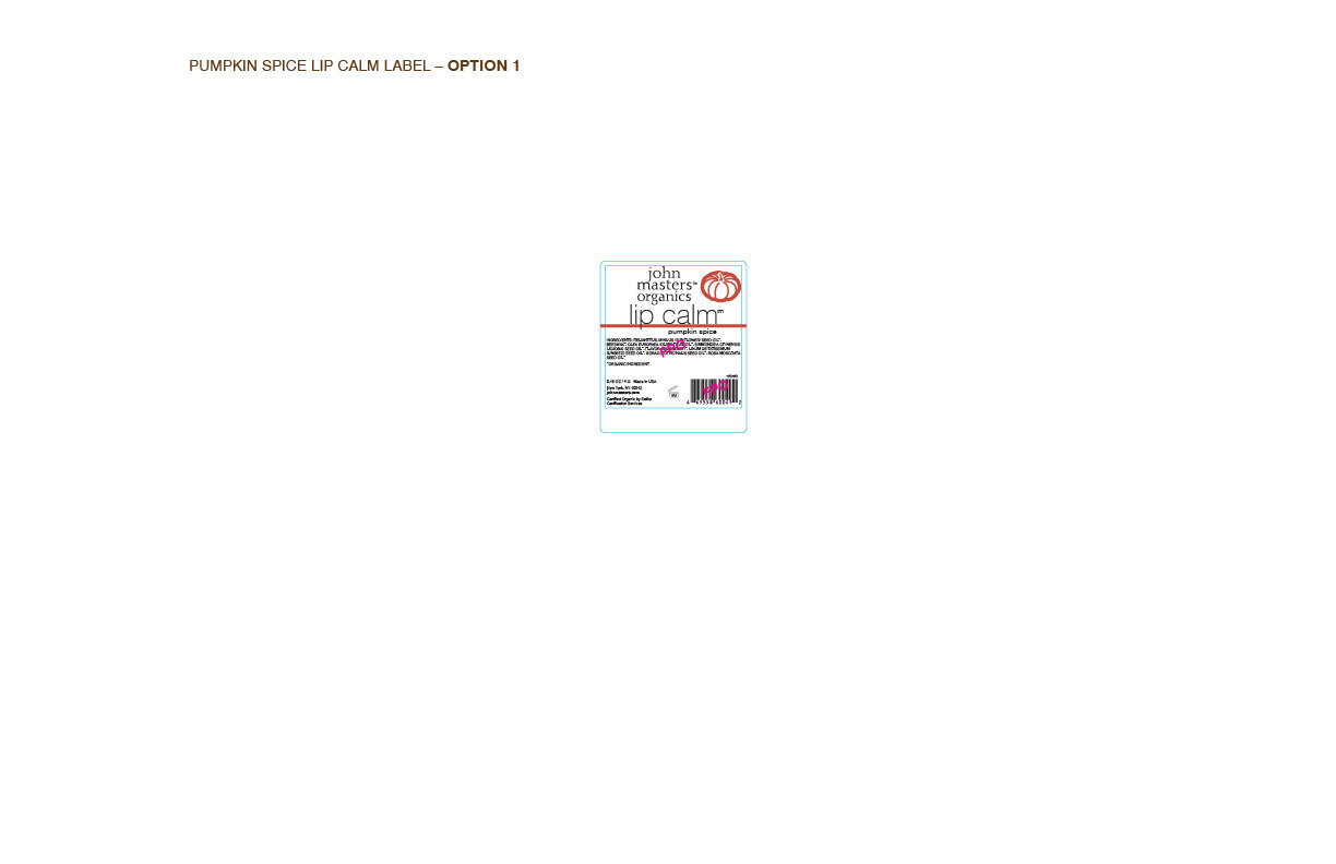
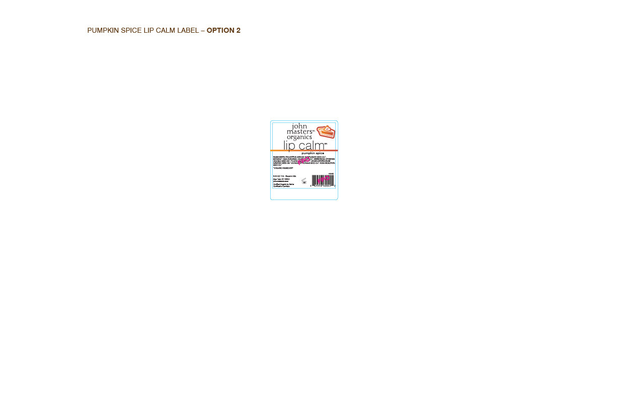
The illustration were narrowed down to 3 after the first presentation.
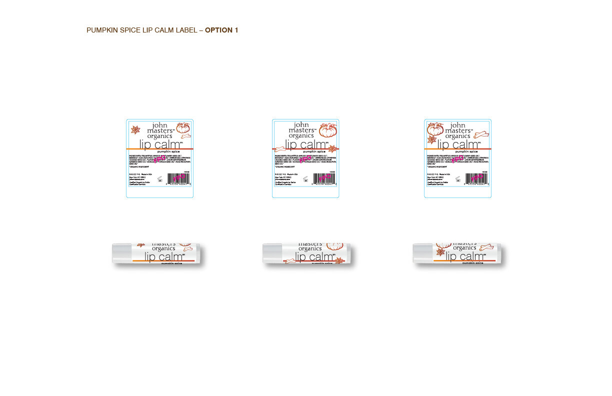
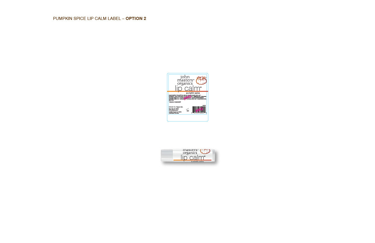
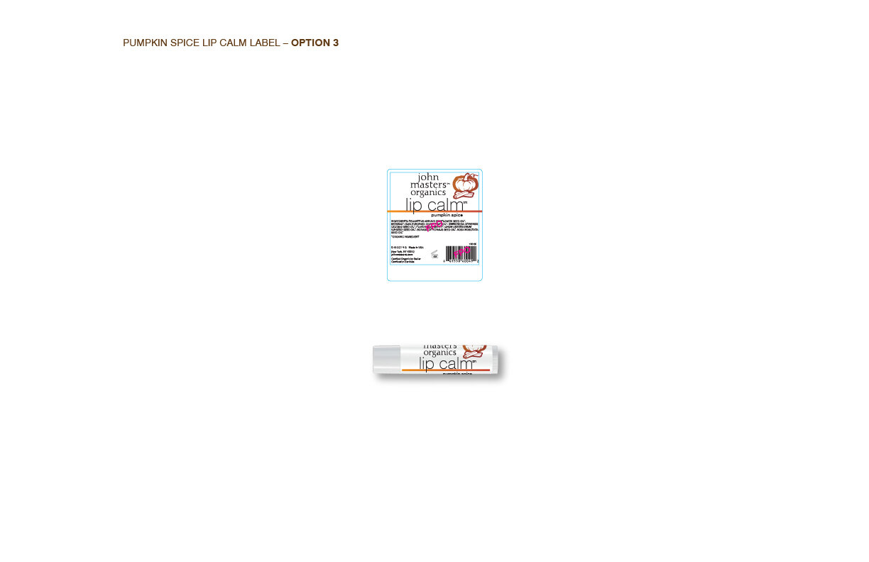
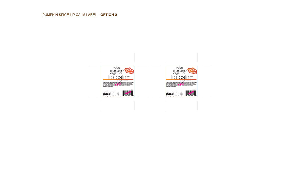
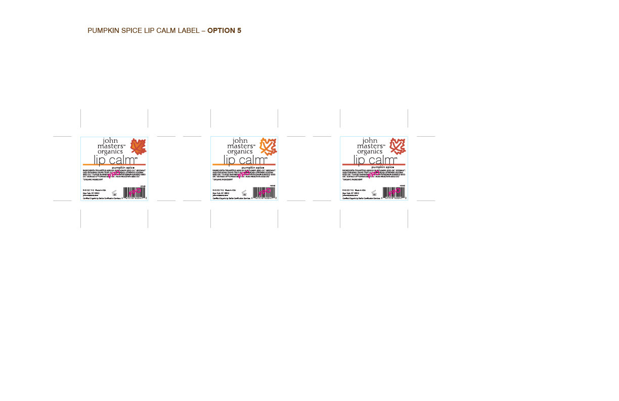
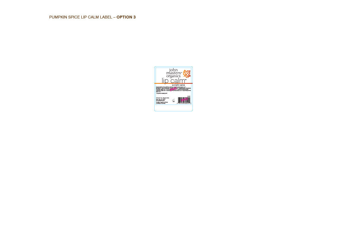
The pumpkin was chosen for the illustration, but the team wanted me to add some of the “spices” in pumpkin spice, so I tried a few options and fine-tuned the pumpkin a bit more.
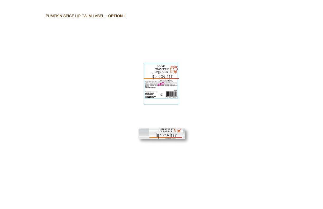
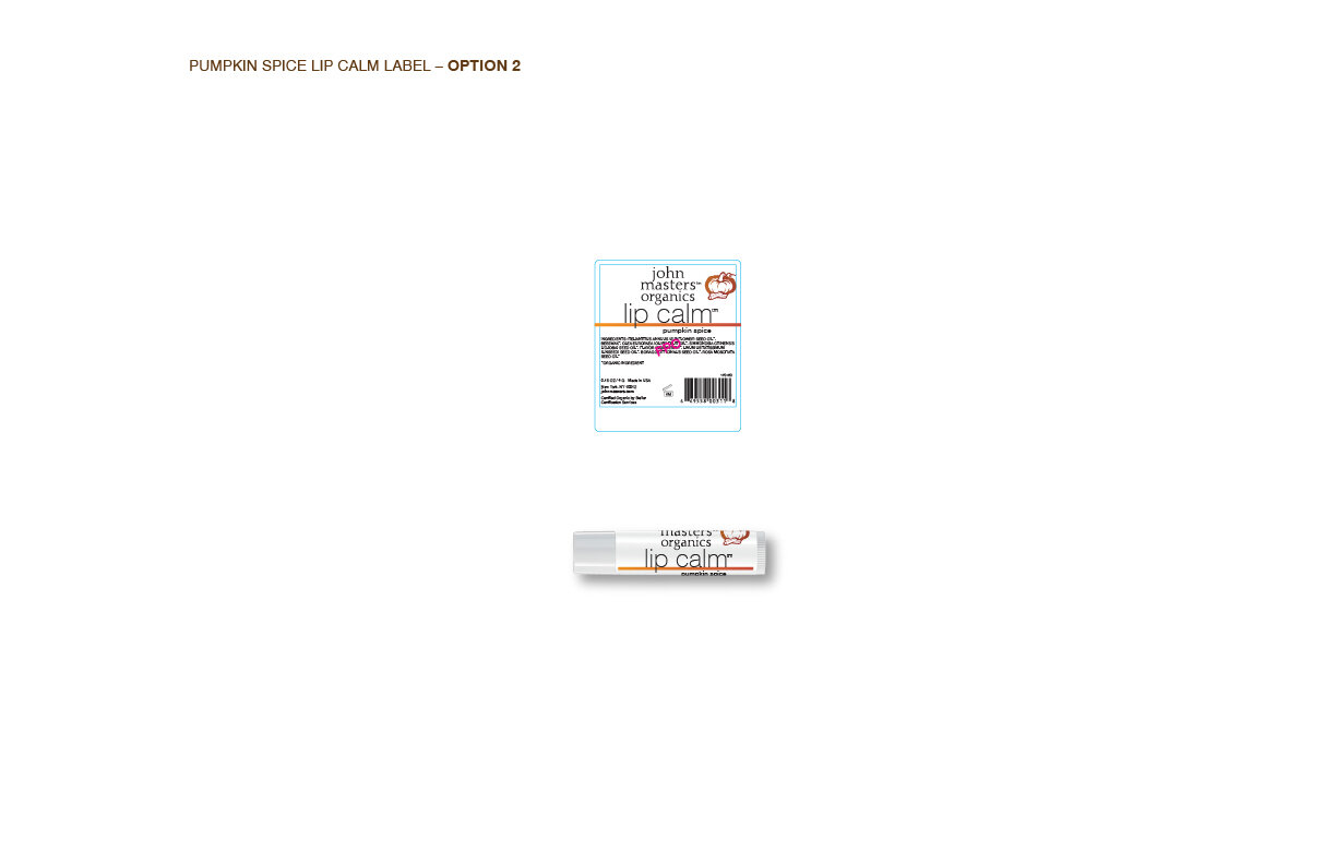
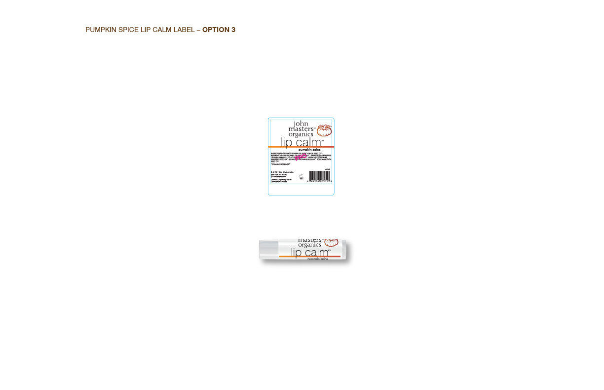
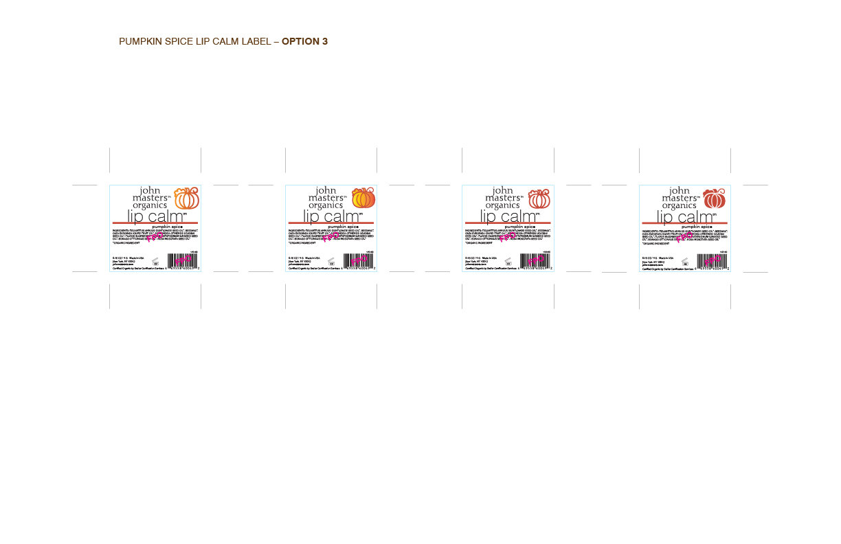
More fine-tuning…
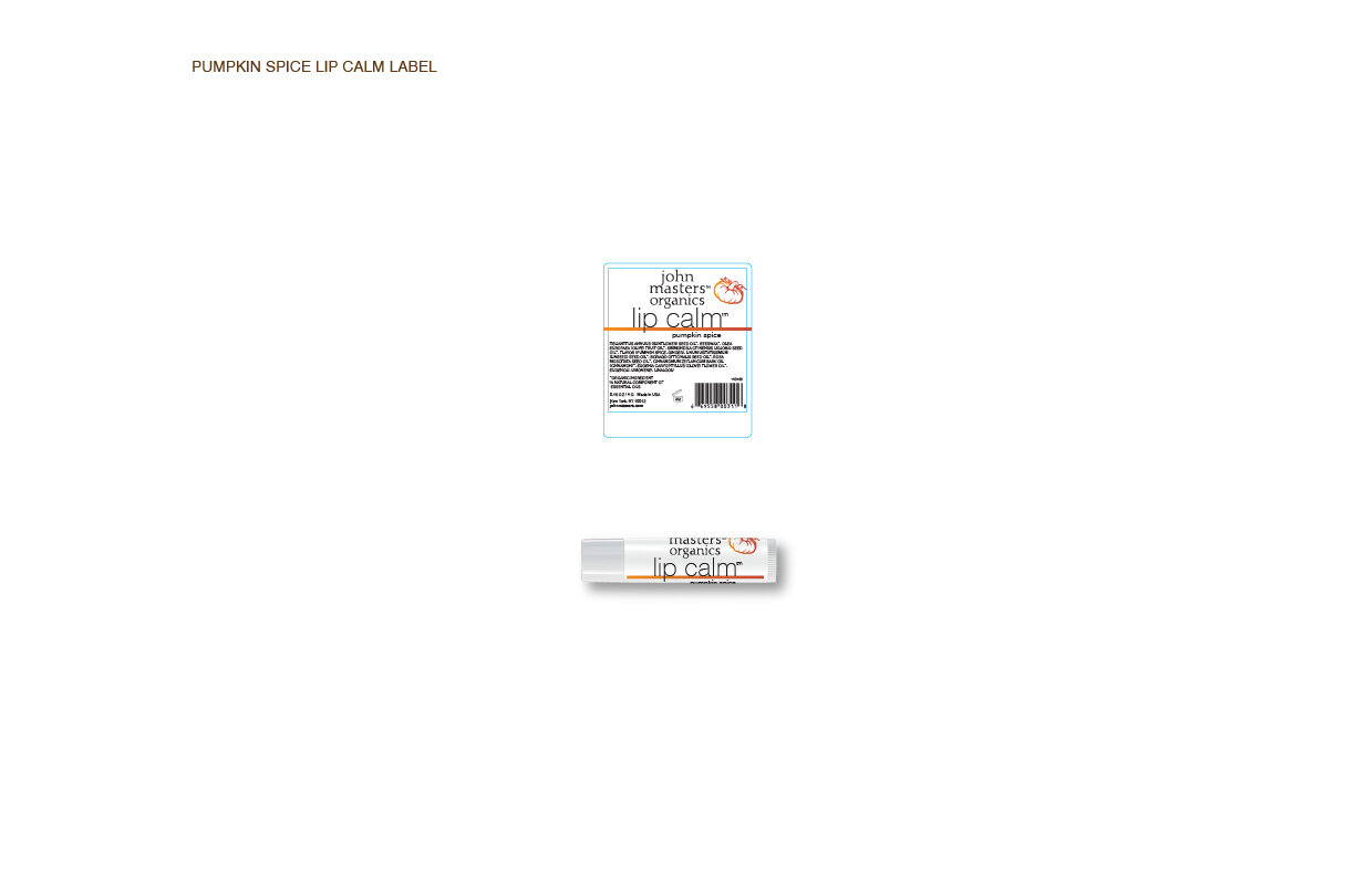
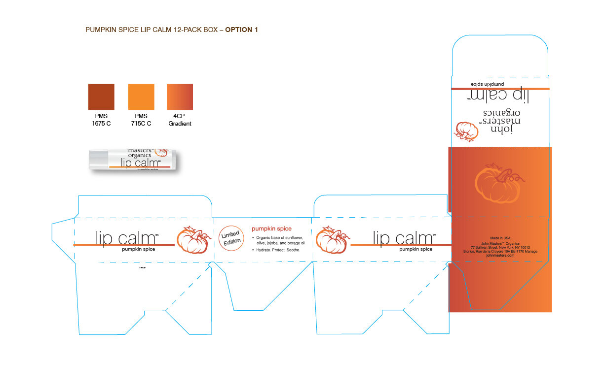
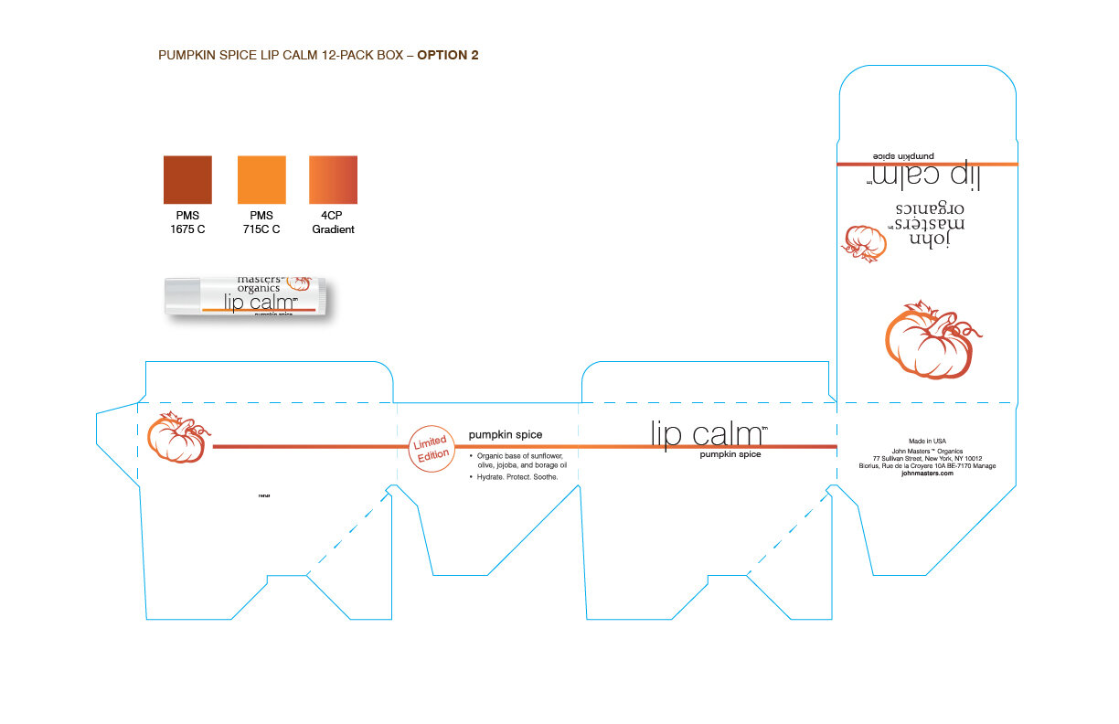
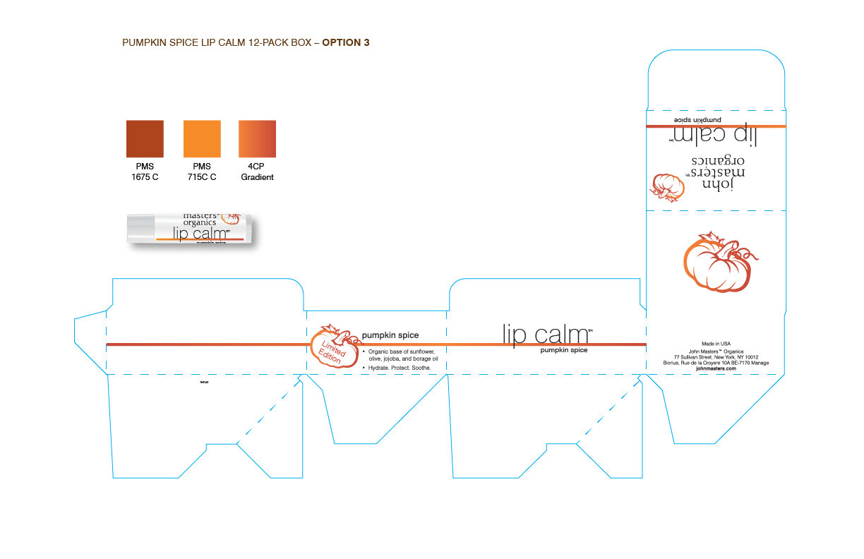
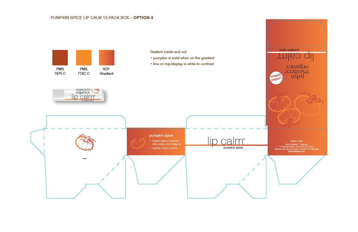
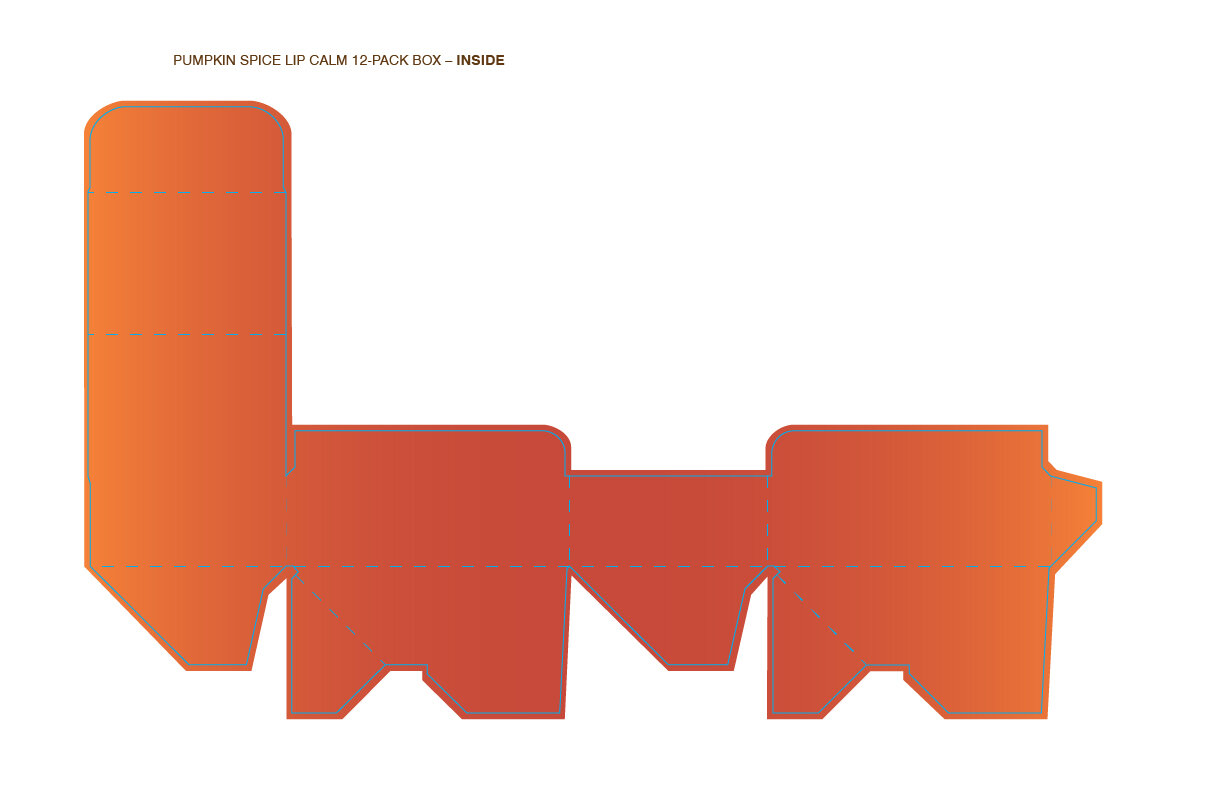
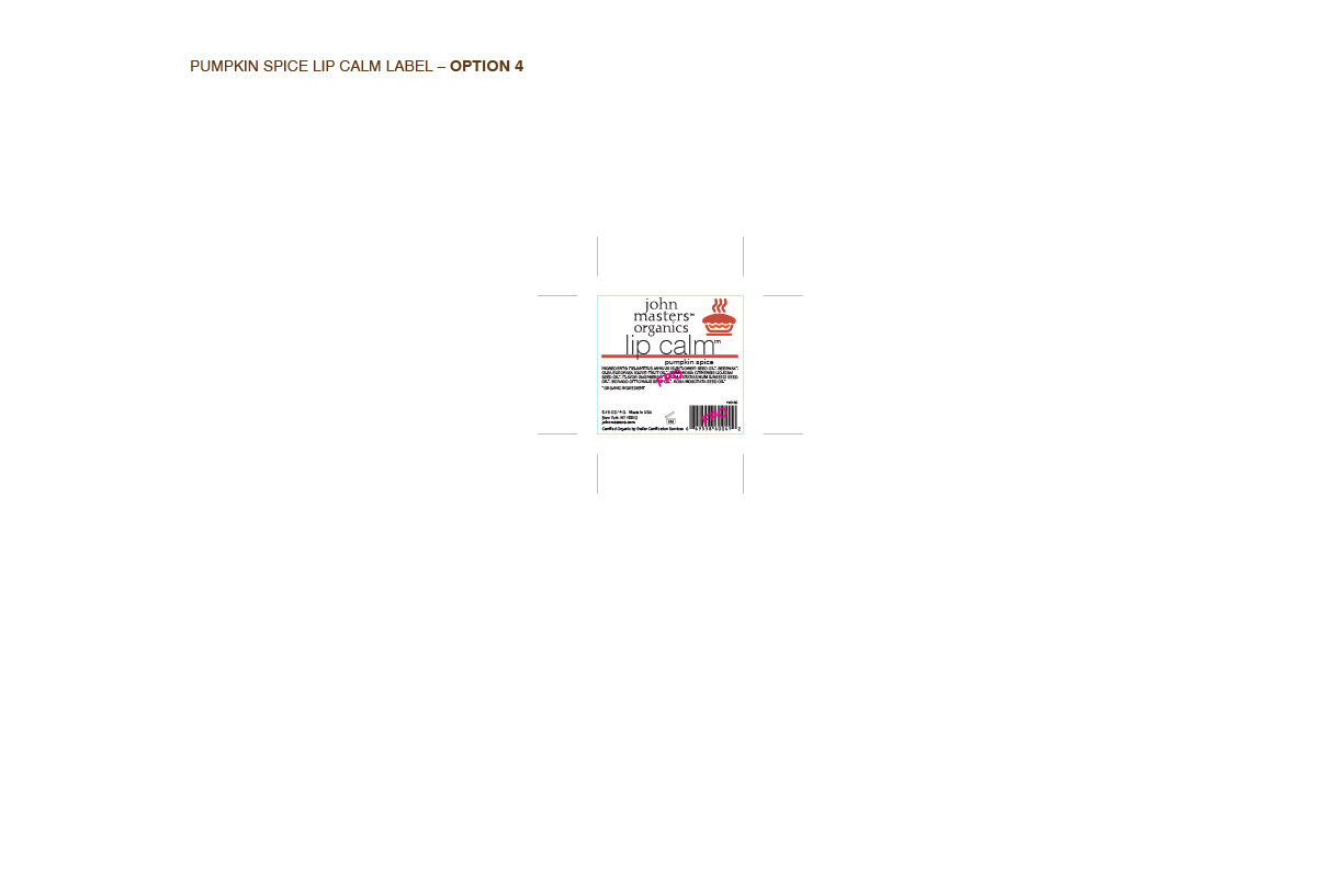
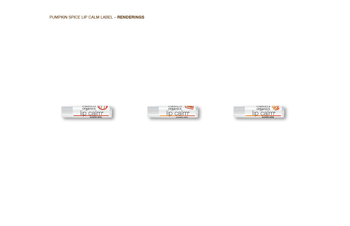
And finally, simply tilting the pumpkin alone created the whimsy that the team was looking for, and next the box design needed to align with the newly redesigned main 4 Lip Calm boxes. So as usual, I came back with a few options.
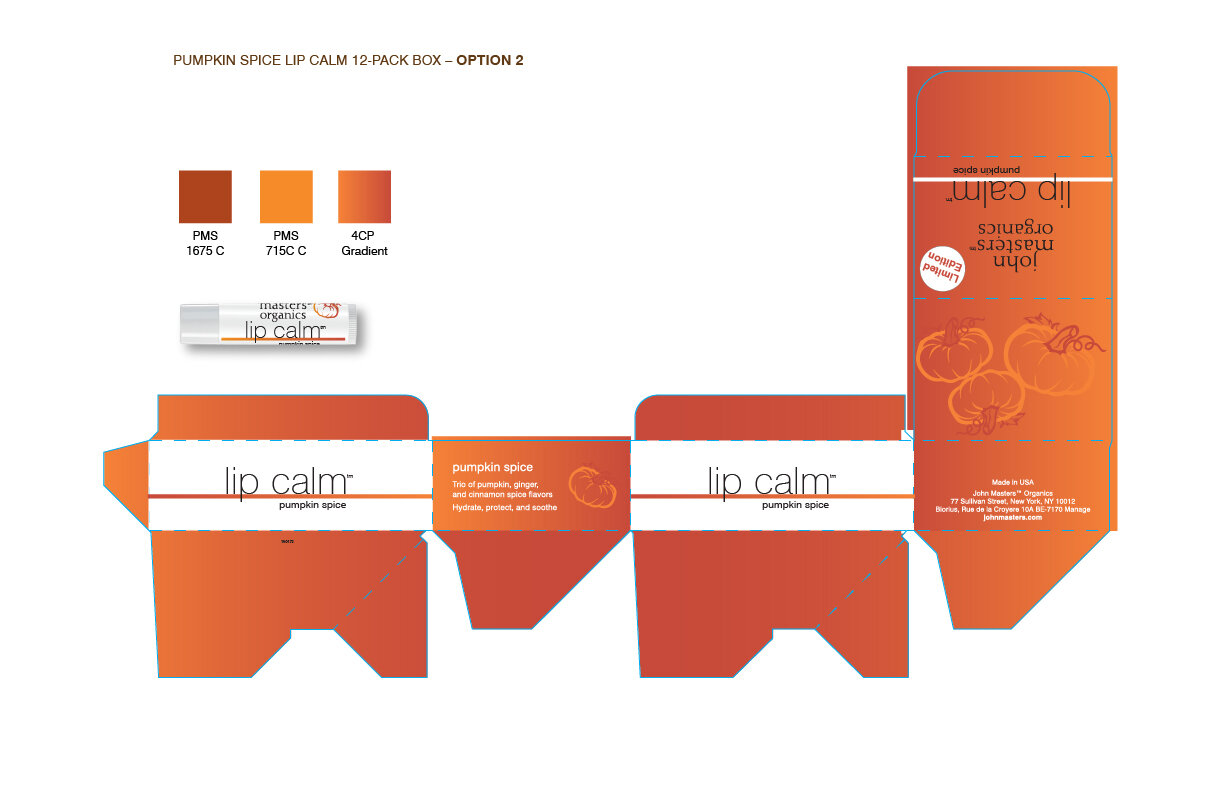

The team liked option 4, but wanted to see it with and without a full flood of color on the outside.

Pumpkin Spice Lip Calm 12-pack box
LIP CALM COLLECTION BOX REDESIGN
The Lip Calms have been John Masters Organics’ most successful products. But selling all four as a package has been very successful during gift-giving times. Once I redesigned the Lip Calm tubes and boxes, the collection boxes needed to follow suit.

Original Lip Calm Collection Box
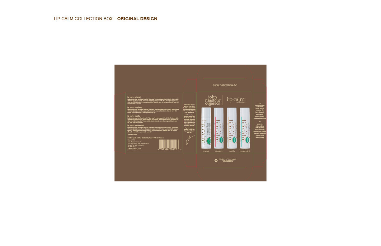
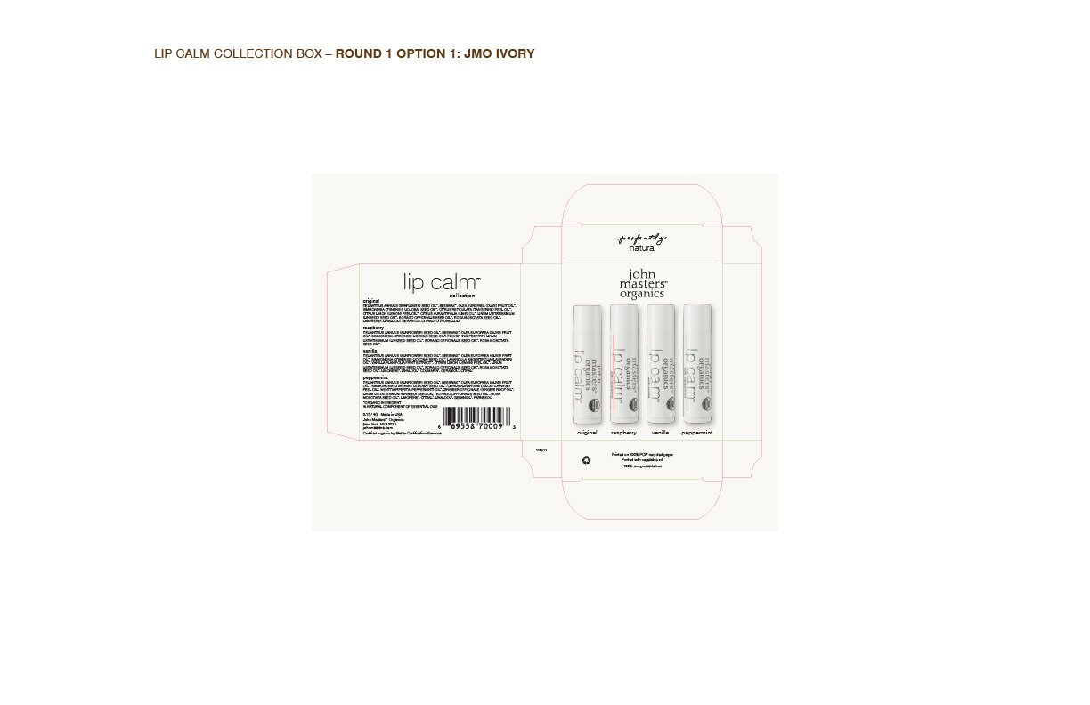
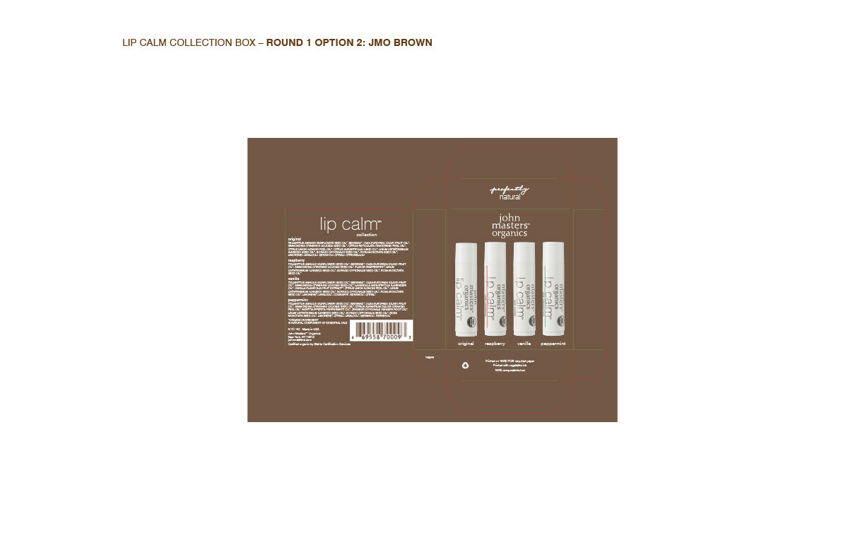
The Lip Calm Collection boxes had a lot of information on them, but the font was so tiny, nobody could read it! After discussing the content with the product development and marketing team, we all decided that the most important information was the ingredient listing, and the rest of the information could be left off of the boxes. My first presentation removed the John Masters story on the side panel, along with the “yes” and “no” lists. I thought it made sense to give an option where the box kept the JMO Brown background, making the tubes pop on the front, as well as an option that match the JMO Ivory, which is on all of the new skincare boxes.
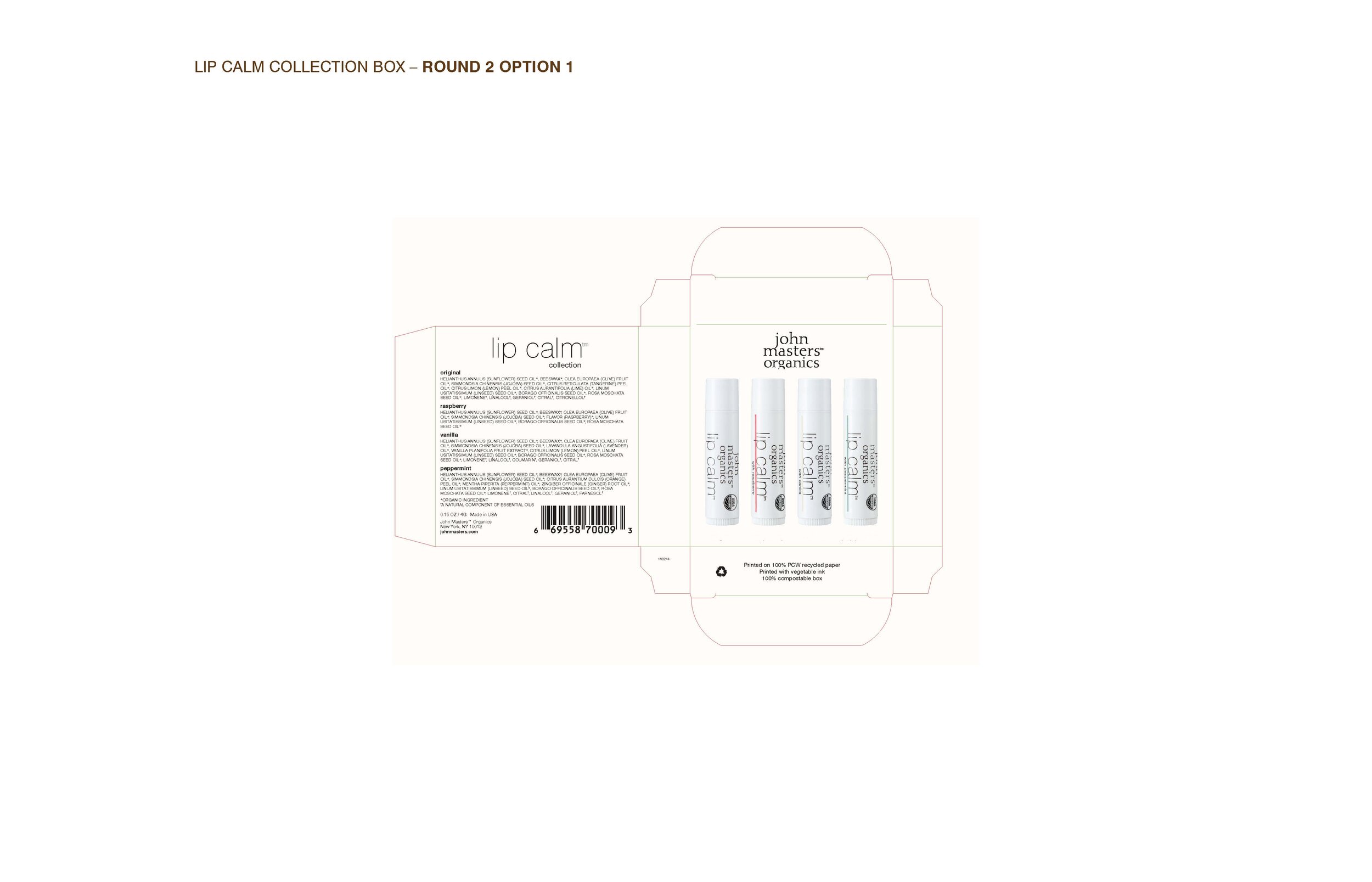
The team decided on the JMO Ivory version box.

Redesigned Lip Calm Collection Box