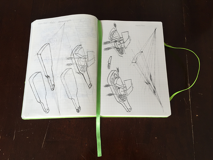
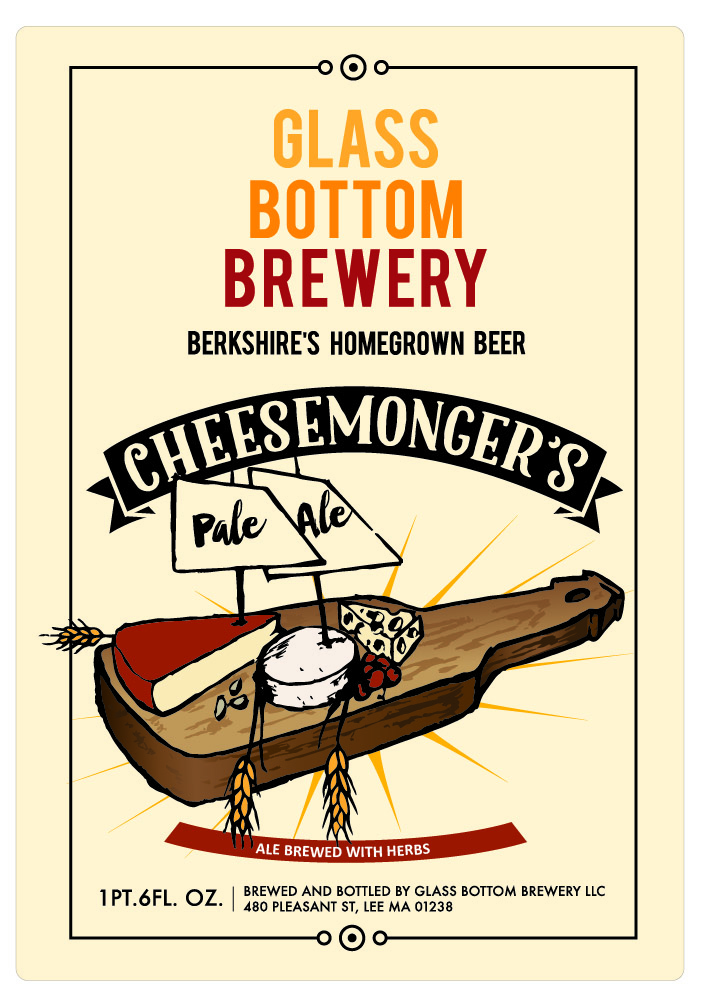
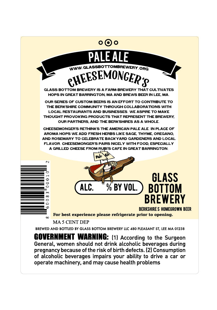
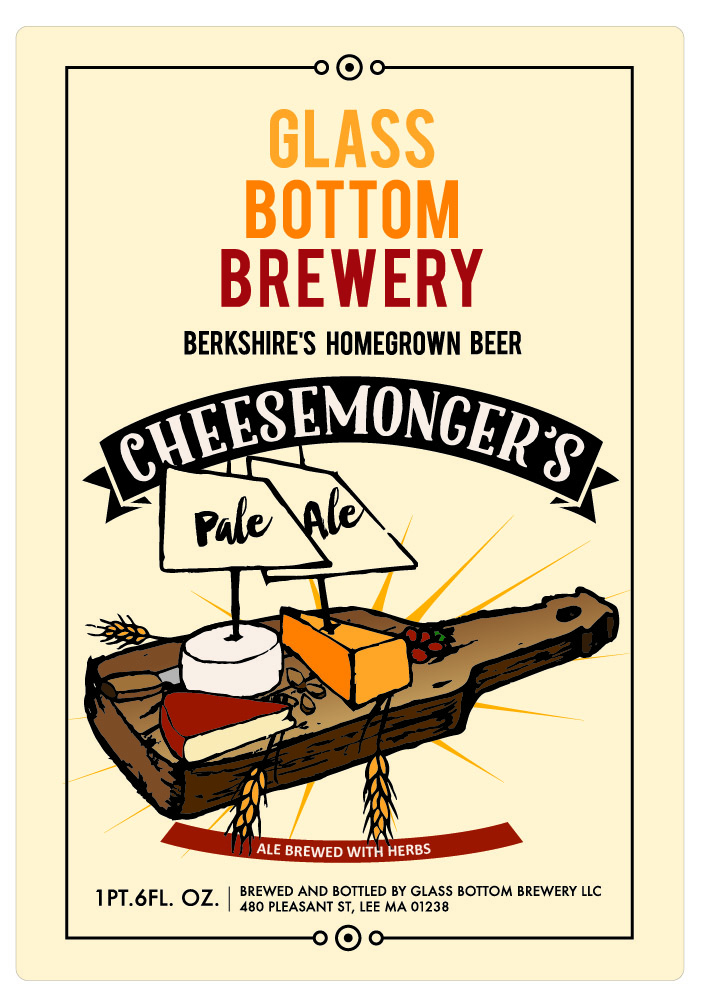
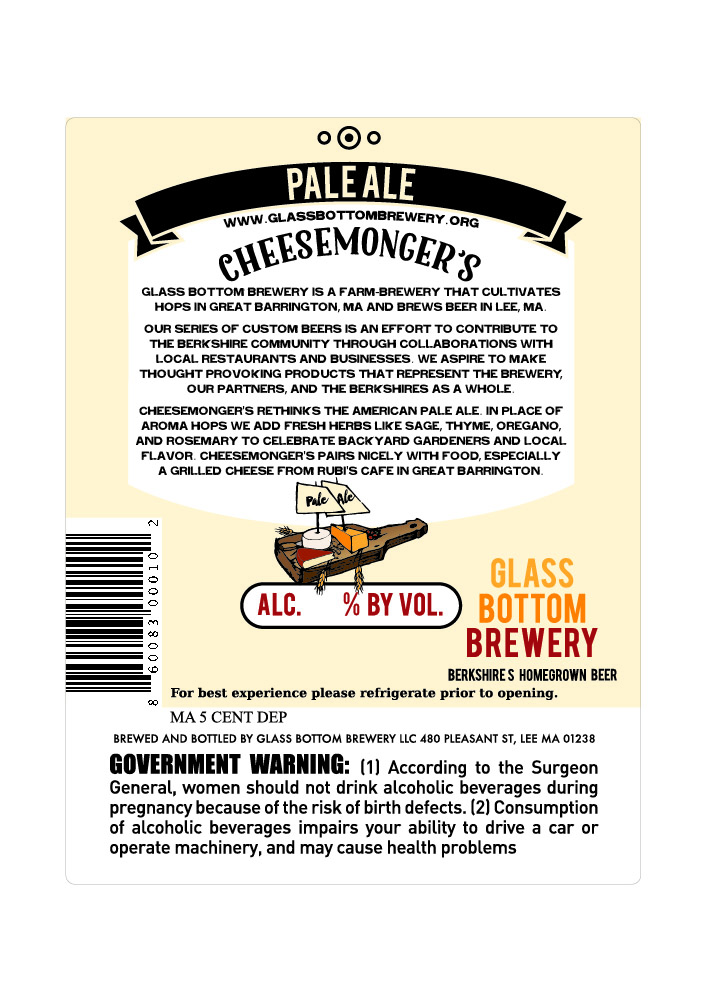
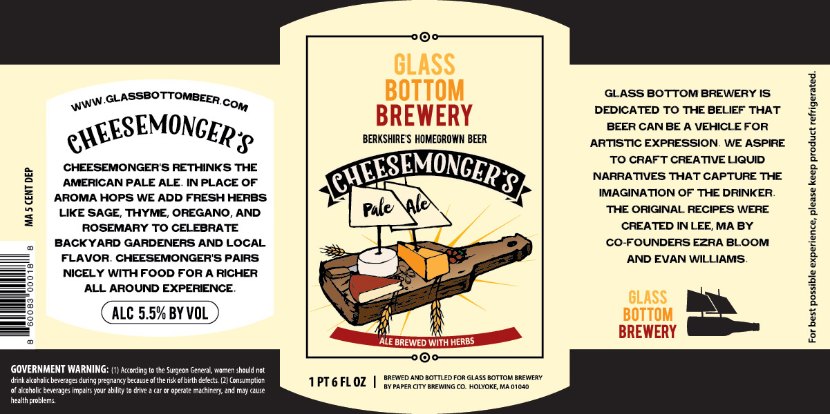
Early in 2015 my friends at Glass Bottom Brewery asked me if I would design the label for their newest beer, Cheesemonger's Pale Ale. They were looking for something sketchy and illustrative. Of course I said yes! Their beer is delicious! So while my friends were out skiing and snowboarding, my blown-out knee and I were in the lodge sketching. (There was barely any snow anyway, so I wasn't totally disappointed)
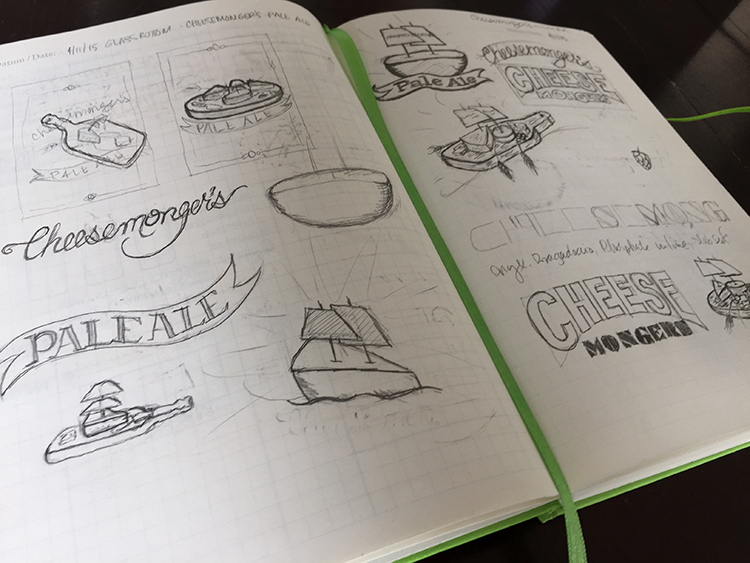
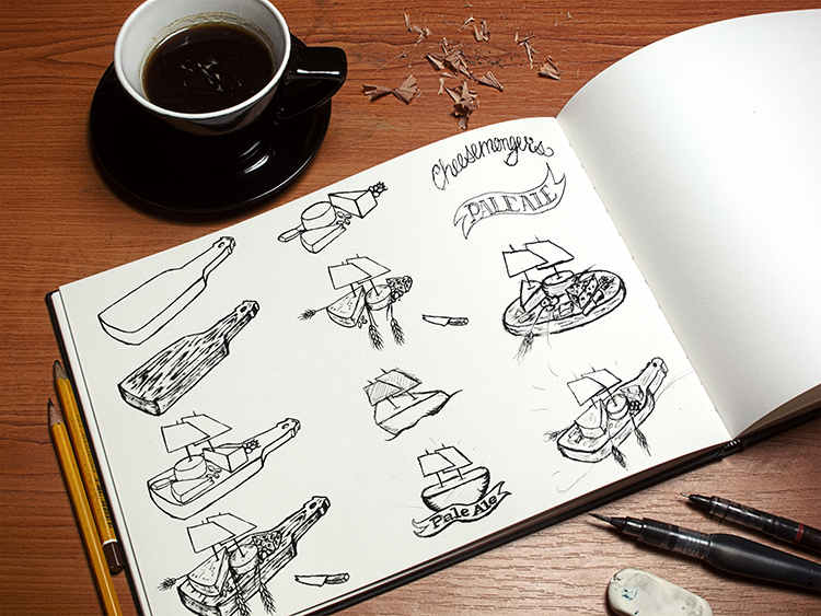
The guys at the brewery were very excited to see the process and be a part of it themselves, so I sent them the rough comps. Normally I wouldn't send that to the client, but they were really into it, so I did, and they were excited about the results, regardless of the roughness of the sketches.
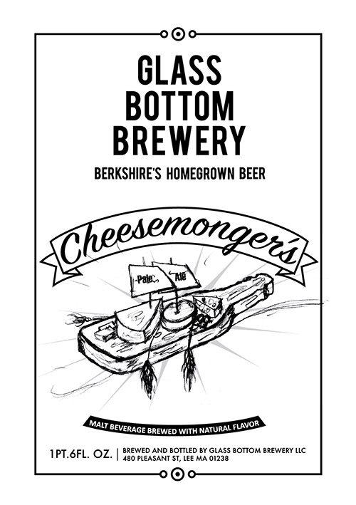
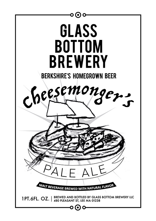
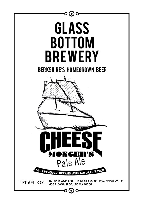
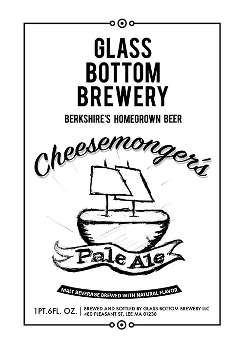
They said that they would've been happy with any of the roughs above, but they chose the first option. My vision for this label was more buttoned up, so I modified and cleaned up the illustration and gave them a color option in addition to the black and white versions.
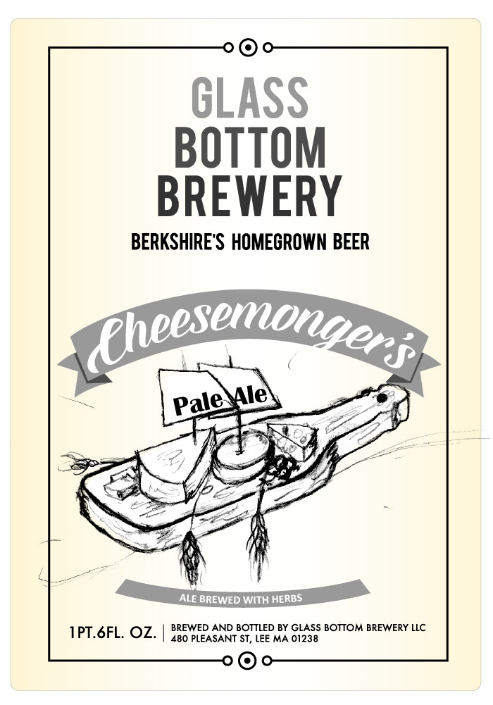
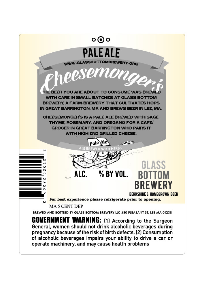
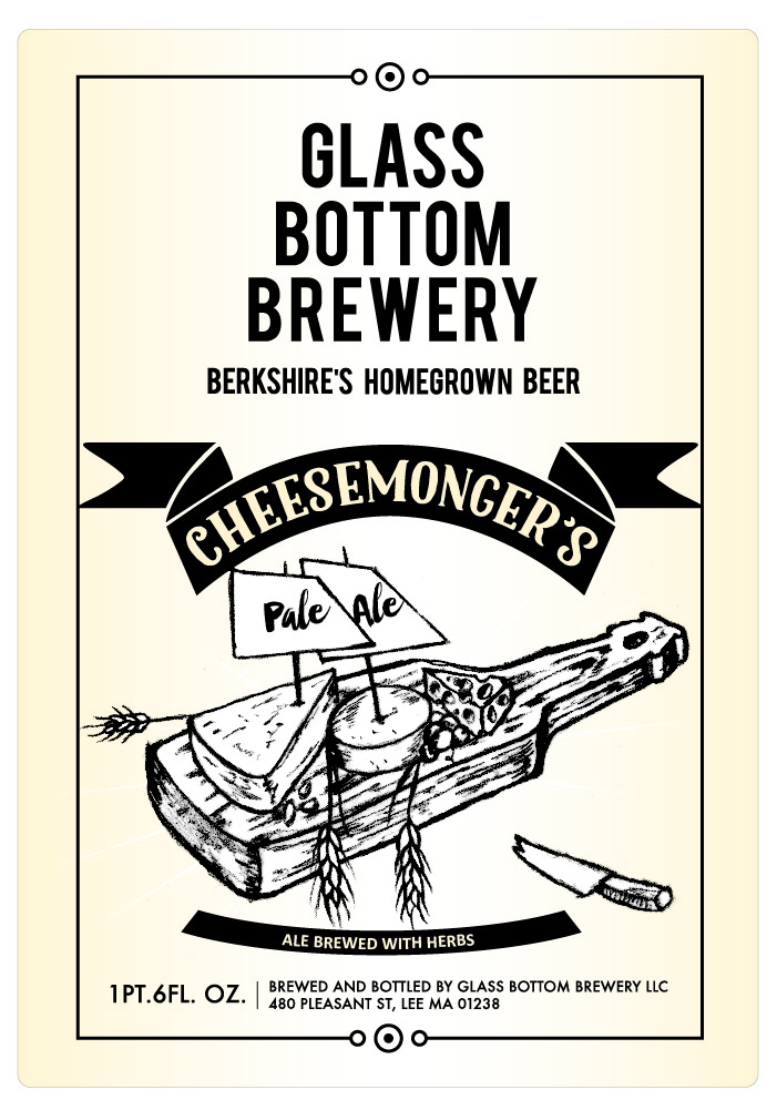
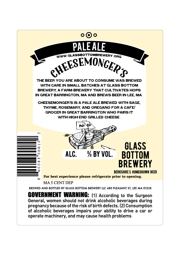
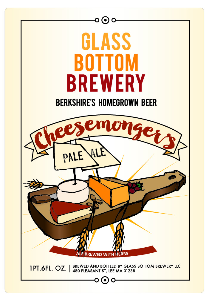
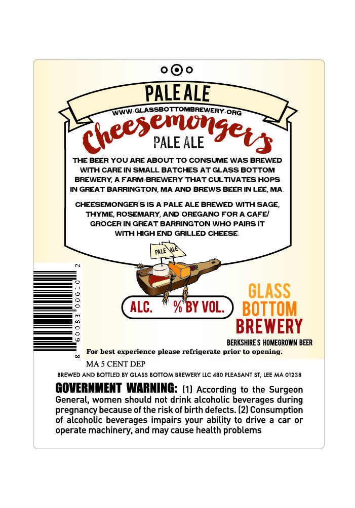
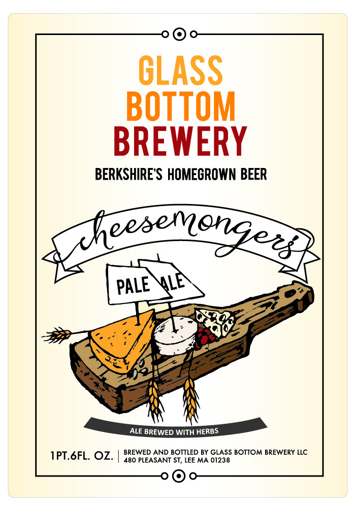
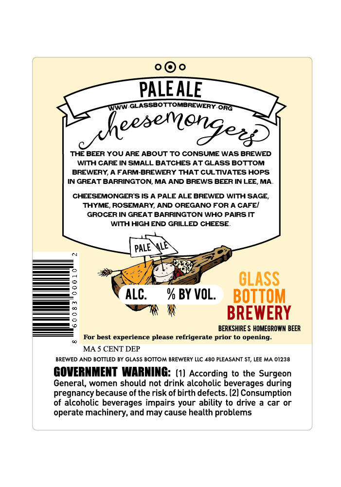
Again they were excited about the comps. As I figured they loved it in color, but wanted less prominent grain than the textured board, but more than the one without. They liked the fonts from the second one and the banner from the third and the arrangement of the cheese on the fourth one.
At this point they wanted to decide which to use, so they asked me for the illustrator files so that they could make some last minute edits after sending it to legal.
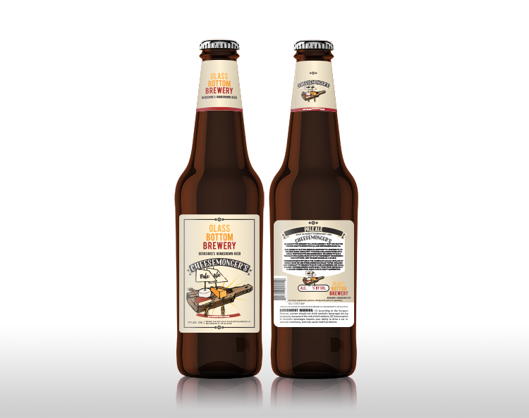
More recently they contacted me with some interesting changes. One of the founders parted ways after a situation arose with the landlord and Glass Bottom Brewery found themselves homeless. After a lot of soul searching they decided to change up their business model and do contract brewing. The first problem they had to tackle was a different labeling method, which required it be one sticker, rather than two. So after some research I came up with a solution that both gave the look of a die cut to make them stand out in the crowd.
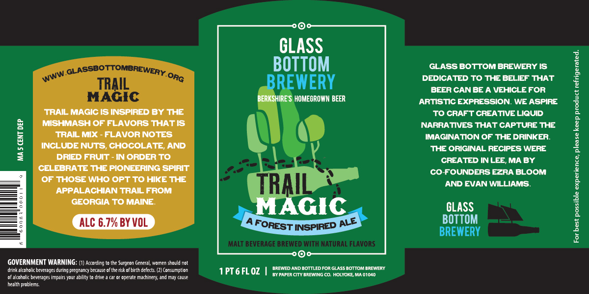
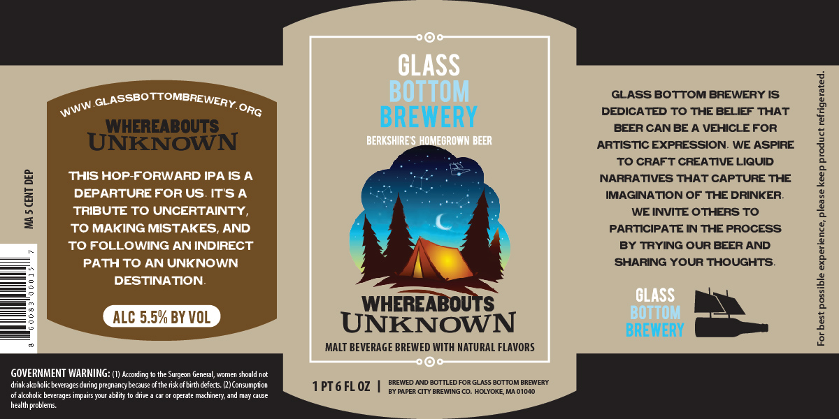
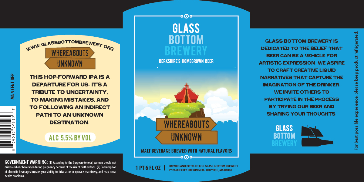
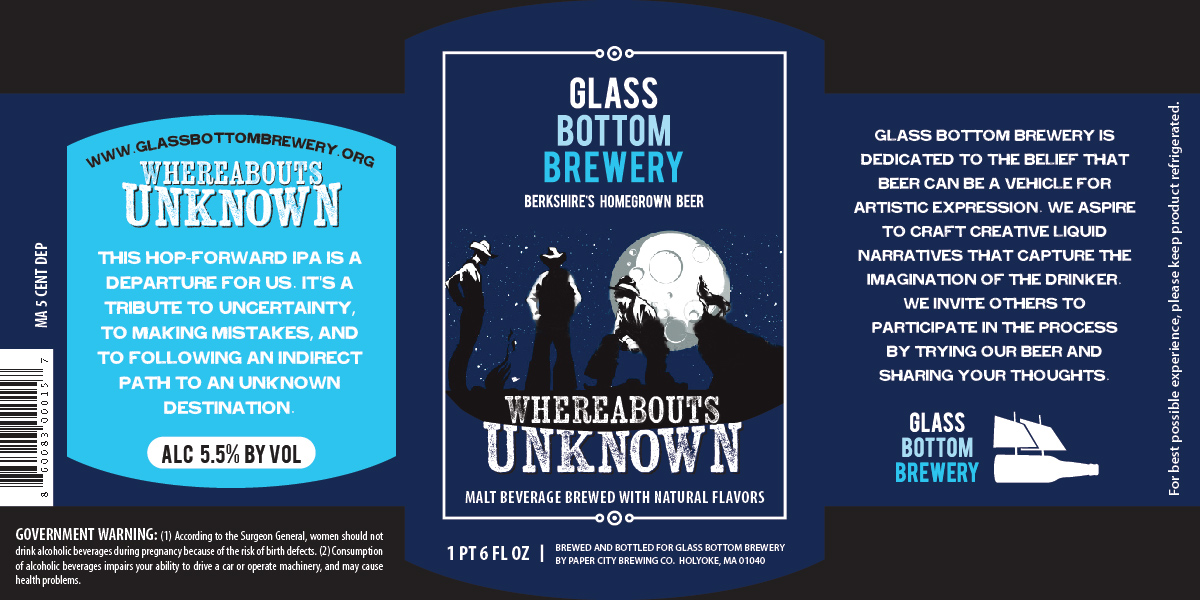
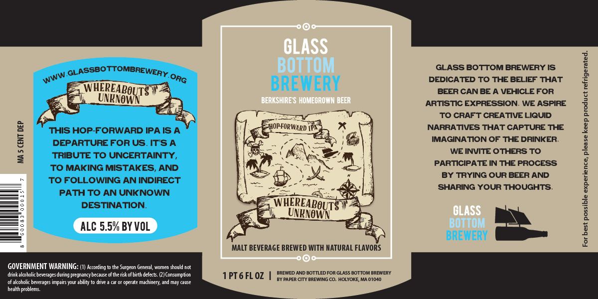
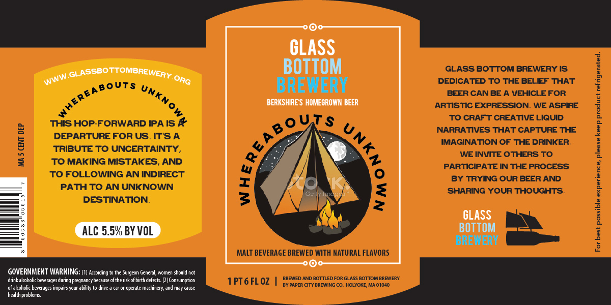
Then they came up with some interesting new beers and again asked me to create new labels for them. The first was an IPA and the name gave nod to their homelessness. They called this one "Whereabouts Unknown". In order to keep the cost down and the timeframe short, I looked at some stock images and illustrations that I would repurpose and modify for the label.
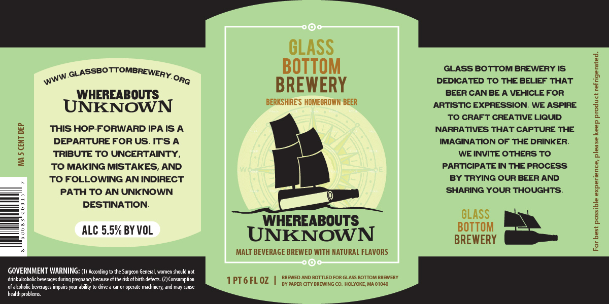
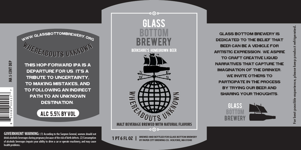
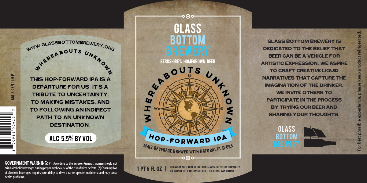
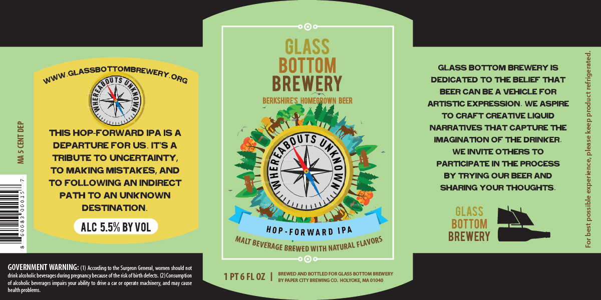
They were really excited about the simplicity of the compass, and really wanted minimal changes.
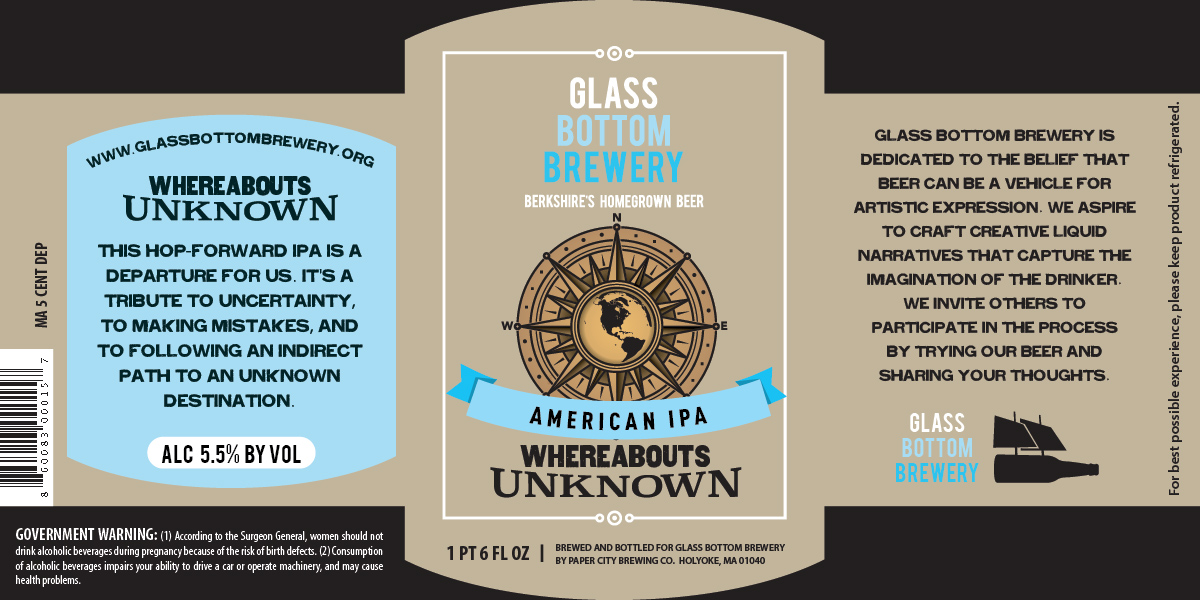
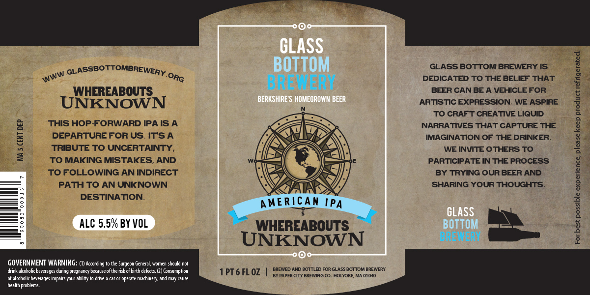
From here they decided that the texture was a nice touch, and after more changes were made to the beer, they realized it was best as a Session IPA.

And it was a big hit!

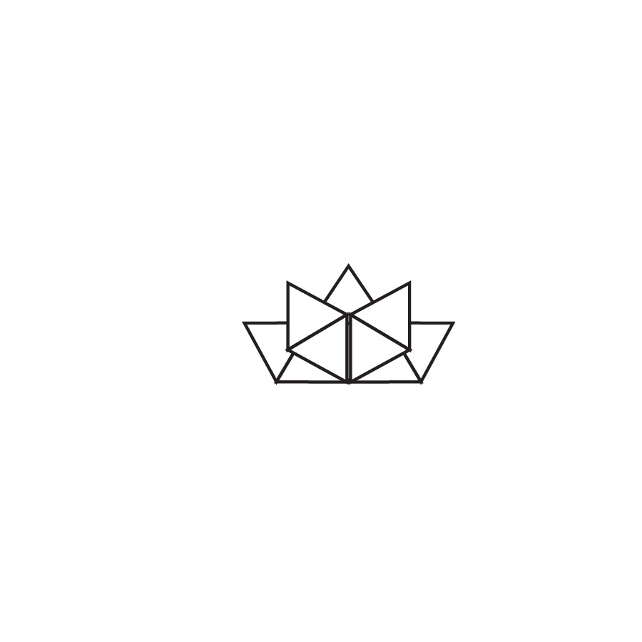
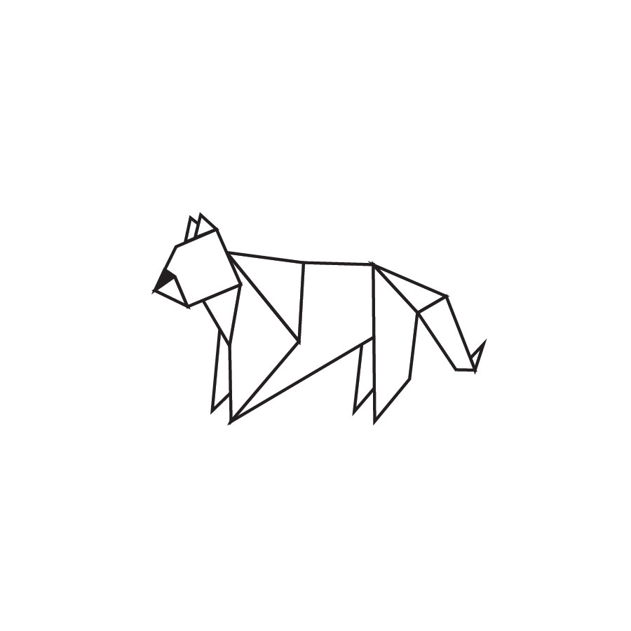
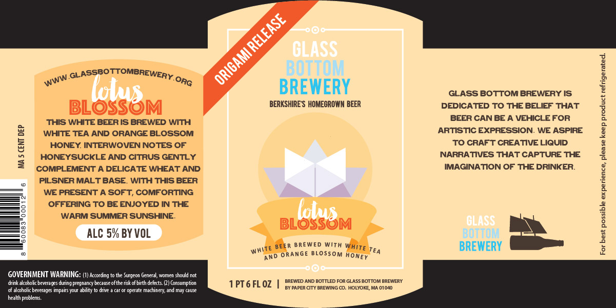
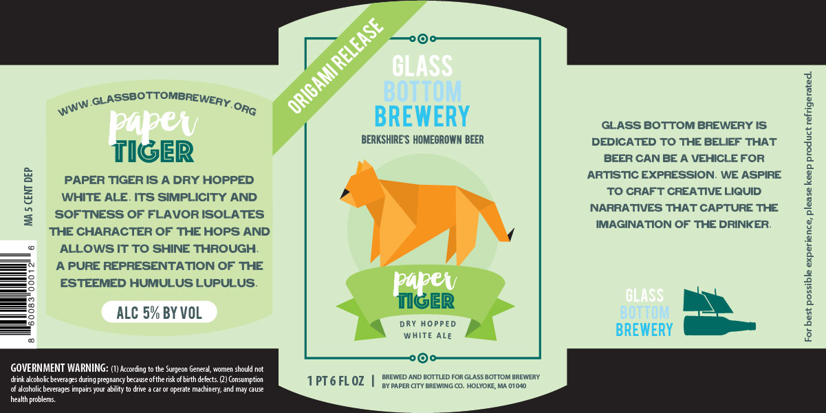
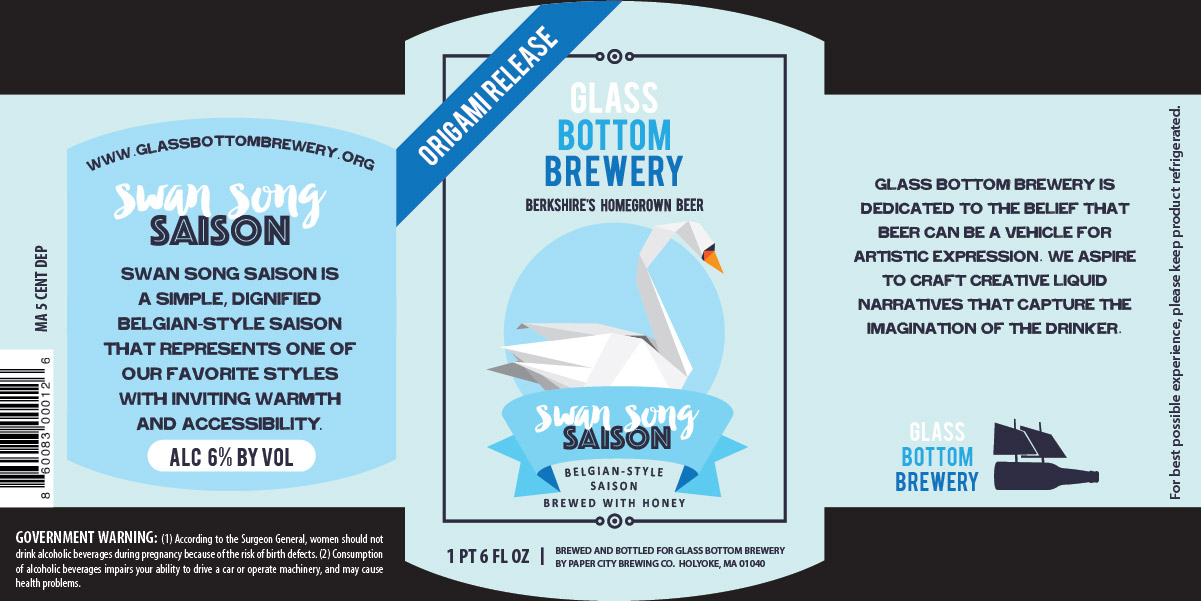
After a few months, they were back! And again I was happy and excited to hear of the next style of beer. This time there were 3 that would be released one after another. When they told me the names they were thinking of for the beers, "White Lotus, Paper Tiger and Crested Crane" for a white beer, a dry-hopped white ale and a Belgian-style saison, I immediately thought of origami. So I sketched a bit and came up with a few options.

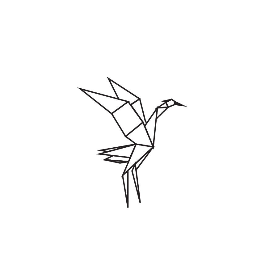
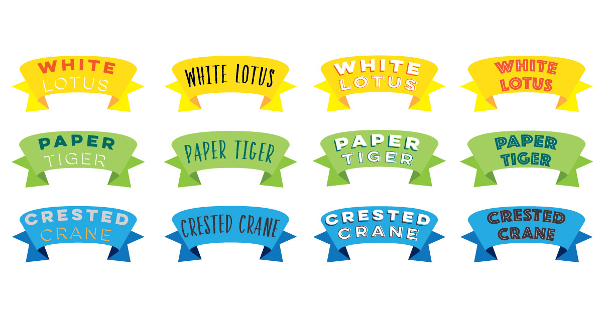

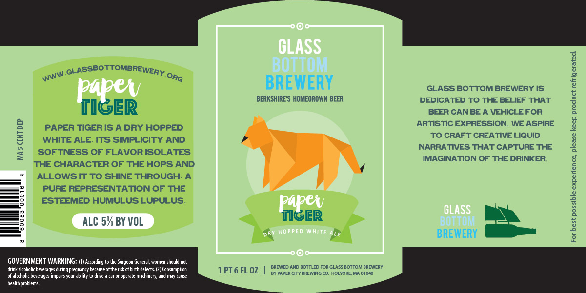
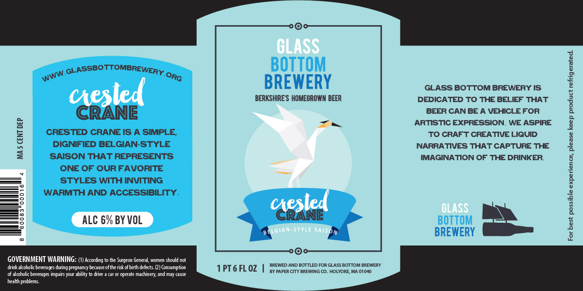
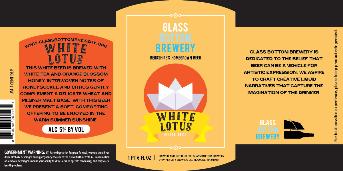

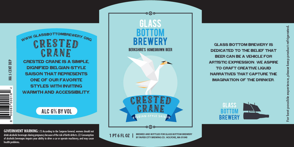
While I love bright colors, these labels seemed to want to be a little more muted. So they decided on the scripty-style text and made a change to one of the names. Instead of "Crested Crane" they wanted to go with "Swan Song Saison", so I went back to the drawing board and did my best to come up with an origami swan!
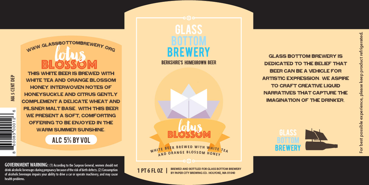
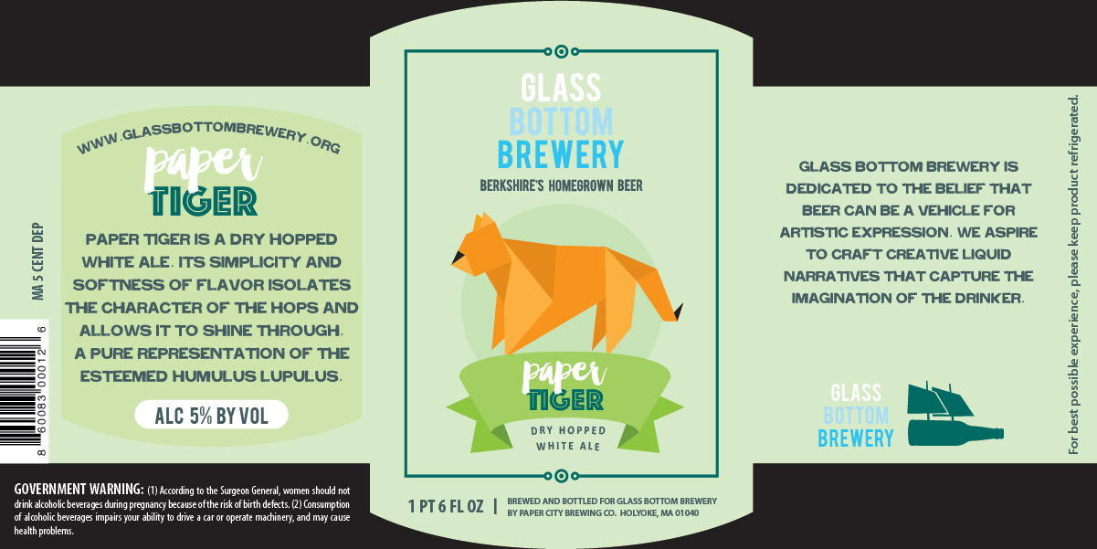
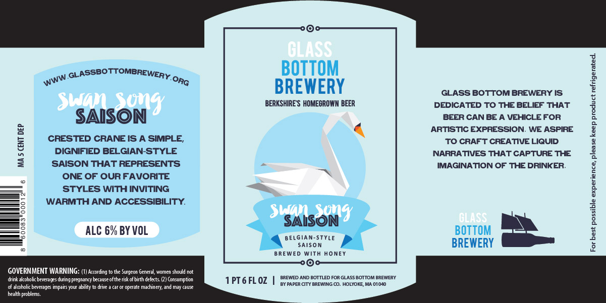
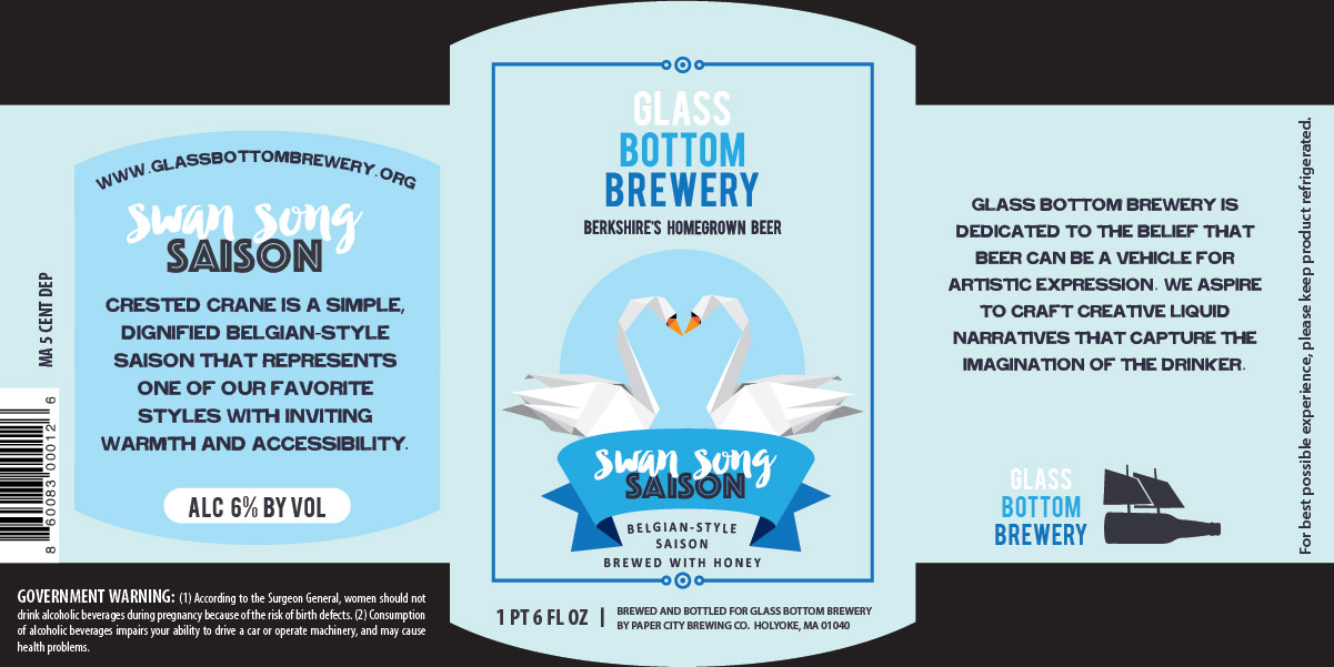
They liked the origami theme so much that they decided to make all three beers "Origami Release" beers.

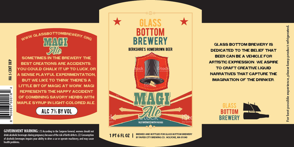
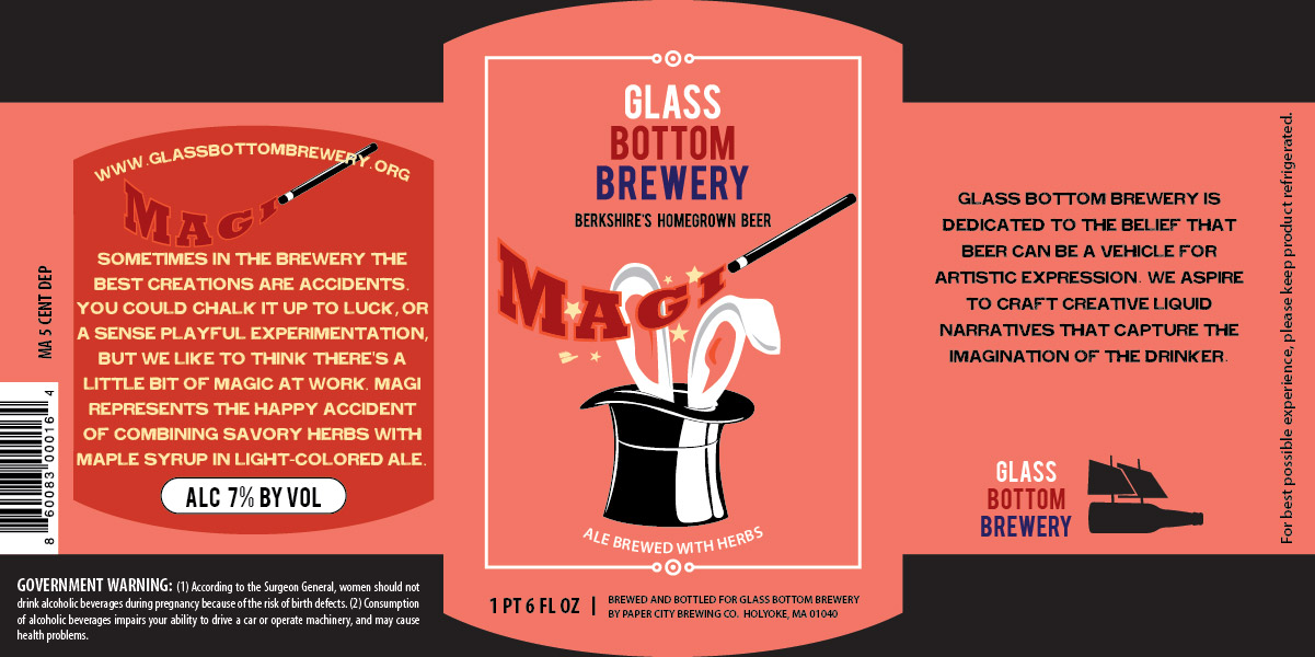
After all of that fun, the guys came to me one more time for their latest creation that they called "Magi" which they didn't mean to have a biblical reference, but rather a magic one. This beer was something that came along magically and they loved it.
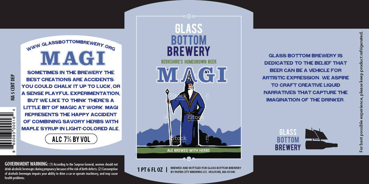

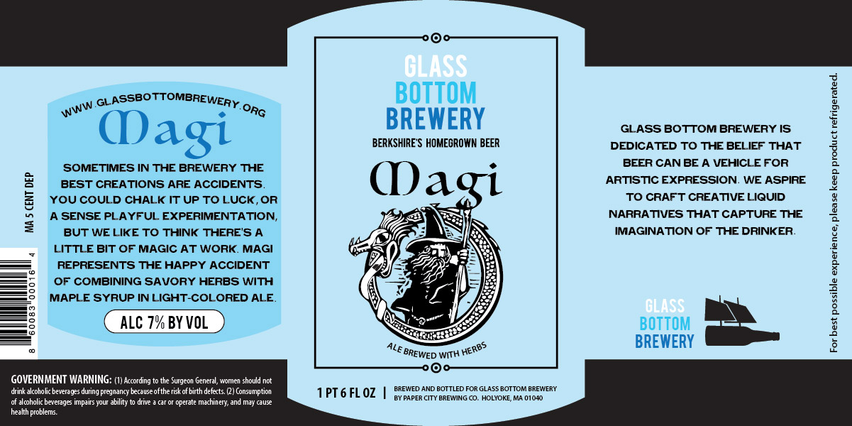
After some conversations, they chose the wizard options, and decided to change the name to "Mage" to avoid any problems.
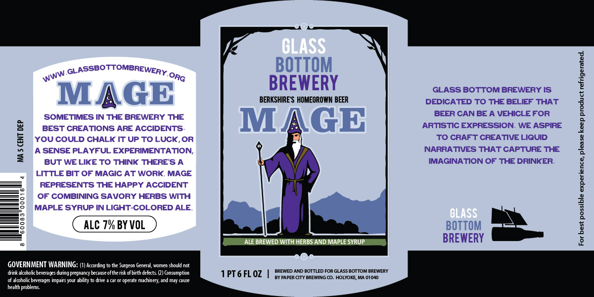
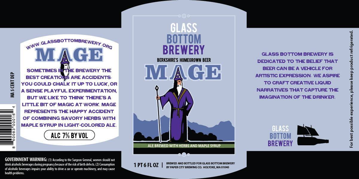
From there they chose the first option, and with that, they were happy!